
Box sets » Fiscal sustainability and risks
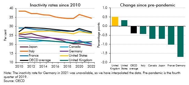
Inactivity fell across the G7 countries in the years prior to the onset of the pandemic and the UK consistently had one of the lowest inactivity rates. Since then inactivity has risen in the UK and US, but fallen across the rest of the G7 countries. This box detailed these changes and looked at ill-health as a driver of inactivity across the G7.
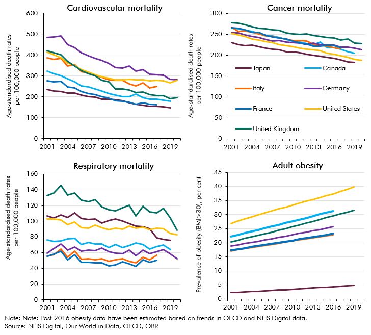
The improvements seen in life expectancy and a variety of other health indicators in the UK over a period of several decades have slowed down and - in some cases - partially reversed. This box detailed these changes and compares them to trends in other G7 countries.
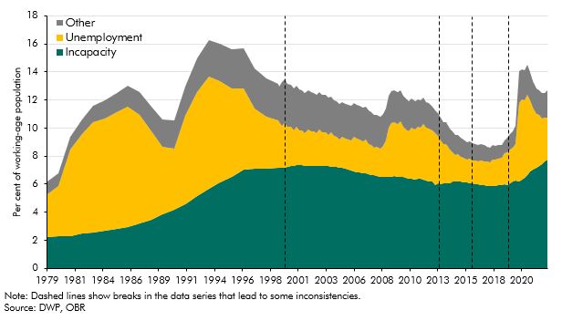
Benefits for working-age claimants with health problems have changed significantly over the last thirty years through the introduction of new benefits and assessments. This box described how the UK welfare system operates for working age claimants with and without health problems, and how this has changed over time.
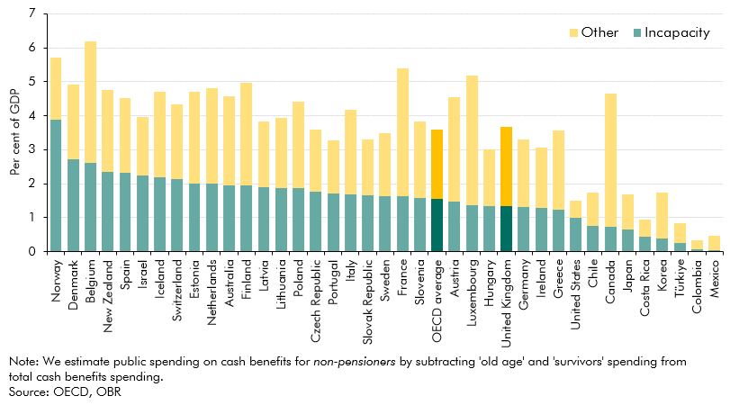
The UK spent close to the OECD average on non-pensioner cash benefits in 2019. This box compared the provision and generosity of health-related welfare across countries, drawing on several international studies.
The referral to elective treatment waiting list in England has risen steadily since the onset of the pandemic, to 7.4 million treatments in April 2023. This box used waiting list and LFS data to estimate the effect on employment and inactivity of halving the waiting list by 2027-28.
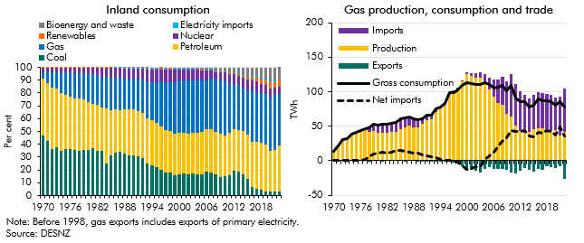
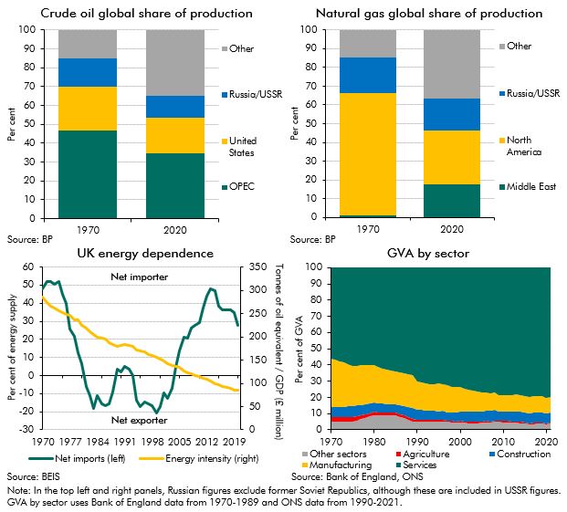
Since 1970 the UK's energy sector has undergone significant shifts following the discovery of oil and gas in the North Sea and the energy shocks of the 1970s. In this box we summarised the historical events and changes that has led to the UK has become increasingly dependent on imported gas.
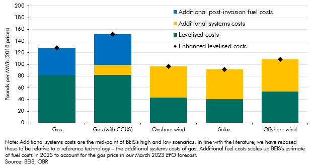
An estimate of the full cost of different energy sources to the power system needs to reflect more than just the construction and operating costs of energy generators that are captured in the levelised cost of electricity (LCOE). In this box we explored enhanced measures of levelised costs of energy.
Since our 2021 Fiscal risks report - which showed that reaching net zero carbon emissions will have significant impacts on the public finances in the UK - estimates of the fiscal impacts of reducing emissions in other countries have begun to be produced. In this box we recapped our 2021 work and discussed how IMF and French analysis compared to it.
Up to July 2022 the Bank of England's quantitative easing (QE) activities had made large profits resulting in large transfers to the Treasury but since then flows have reversed. This box described what the whole lifetime direct costs of QE would be based on our March EFO assumptions.
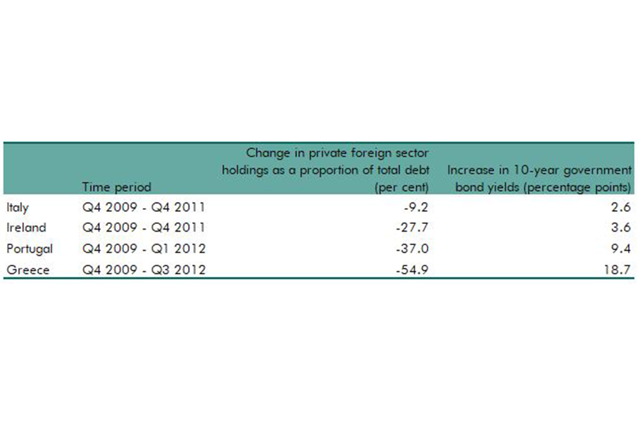
As the stock of foreign holdings of UK debt has risen this century, so have questions about the risks of increasing, relatively high, levels of these holdings. This box looked at the why holdings of debt by foreign investors may lead to greater market volatility.
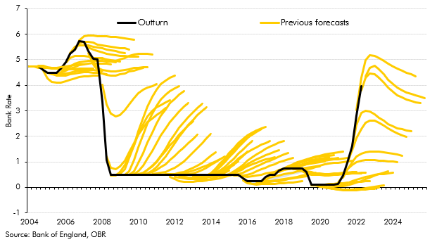
There has been a notable shift in the environment of interest rates over the past 18 months in the UK. This box looked at the extent of surprise for rate rises relative to market implied expectations and the increase in capital adequacy ratios of UK banks since the global financial crisis.
The possibility of a new vaccine-escaping Coronavirus variant cannot be ruled out. In this box we explored the possibility of such an escape and investigated the potential economic and fiscal consequences.
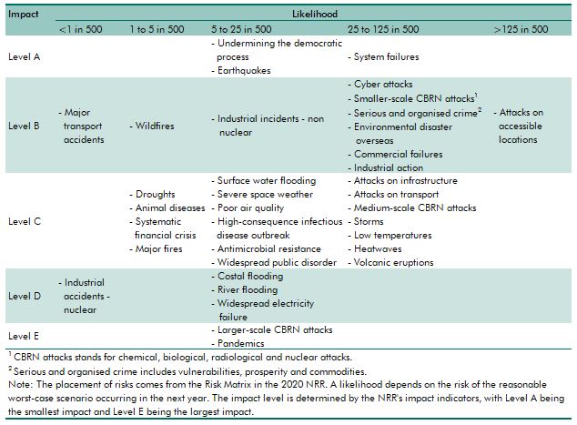
The National Risk Register (NRR) provides the Government's assessment of the likelihood and potential impacts of a range of risks to the safety and security of the UK. In this box box we compared the topics covered by the NRR and those we have focussed on in our risk analysis.
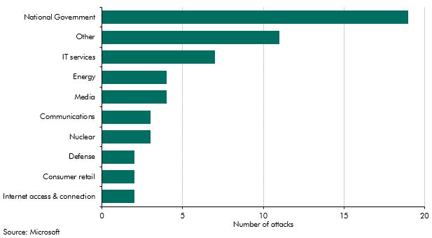
The Russian invasion of Ukraine in February 2022 led to questions over the impact that cyber attacks were likely to have during the conflict. This box looked at the history of cyber-related activity in the region, and the evidence available for cyber impacts of the conflict to date.
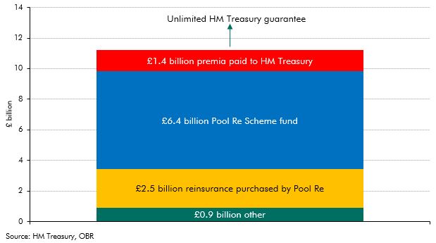
Given signs of pressure in the cyber insurance market, this box considered previous precedent of government intervention to help private insurers provide cover for large and uncertain risks. This included a detailed look at Pool Re, one of the longest running government-guaranteed reinsurance schemes, for terrorism risk.
There are signs that global economic integration has stalled in recent years on some measures and reversed on others. This box discussed the implications of integration for the economy and public finances.
The recent surge in energy prices and its associated effects on inflation has led to comparisons with the last major global energy crisis in the 1970s. This box examined the ways in which the shocks are similar and how they are different, with a focus on how the UK economy in some ways has become more resistent to energy price shocks.
Persistently higher energy prices can reduce the supply capacity of the economy. In this box, we use a production function to estimate the impact of higher fossil fuel prices on potential output.
In May 2022, the Government announced a package of measures to support households with the cost of living. In this box, we explained how we had adjusted our March 2022 Economic and fiscal outlook forecast for these policies.
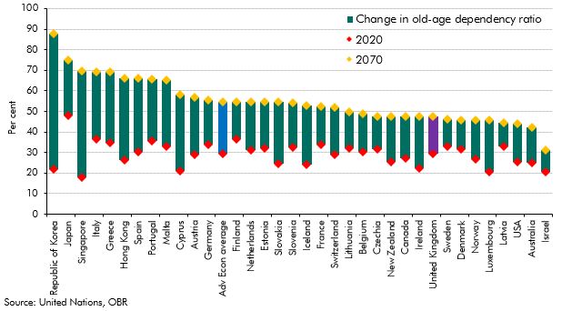
The populations of most advanced economies are ageing, placing new demands on these countries' public finances. This box explored why the UK population is forecast to age slower than most advanced economies over the next fifty years.

The pandemic generated only modest structural damage to the fiscal position but did still create a gap in what the Chancellor considered a sustainable fiscal position. This box compared the scale of fiscal consolidation facing the chancellor and his approach to repairing the public finances with the challenge that faced Chancellor George Osborne after the financial crisis.
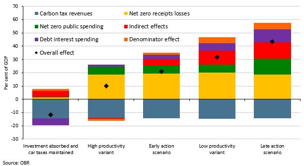
Our 2021 Fiscal risks report explored the fiscal risks posed by climate change and the Government’s commitment to reduce the UK’s net carbon emissions to zero by 2050. This box examined the policies announced in the Budget, Spending Review, and Net Zero Strategy in October 2021, and the significant rises in market prices for hydrocarbons since we completed our Fiscal risks report, and how they had changed the risks associated with climate change and decarbonisation.

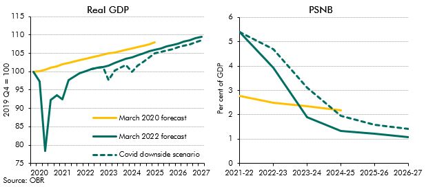
Fiscal space is an important consideration for how quickly and effectively a country's government can respond to a large shock. In this box, we explored different definitions of fiscal space over time, its multi-faceted nature and how the UK's position has evolved over the course of the coronavirus pandemic.
The Government announced in March 2021 that the coronavirus job retention scheme (CJRS) would be phased out completely by the end of September 2021. In this box, we looked at the latest evidence on the number of people on the scheme and their concentration in certain industries, as well as the latest data on vacancy rates. We also discussed how these data related to our labour market assumptions from March 2021.
Broader measures of the balance sheet are useful to consider when thinking about fiscal sustainability. However, under the national accounts framework even the broadest measures fail to recognise natural assets – the very assets affected by climate change. The box discussed the frameworks under which the ONS produces the environmental and natural capital accounts, and which bodies are working to address the gaps in these frameworks. The box also discussed key messages from the Dasgupta Review and Treasury’s response.
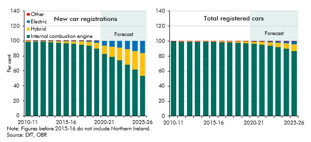
With the sale of new petrol and diesel cars to be banned from 2030, the transition to electric vehicles is a key element in the UK’s path to net zero emissions. This box outlined the recent growth in alternatively fuelled vehicle sales, the fiscal implications of this and the role of policy in the transition.
One of the greatest challenges in achieving net zero in terms of both cost and technical difficulty will be to decarbonise the more than 28 million homes in the UK that rely on fossil fuels for heating (typically gas central heating) and are, for the most part, poorly insulated. In this box we examined the similarities and differences between the future transition of domestic heating and one of the past, that of the switch to natural gas over the decade to 1977.
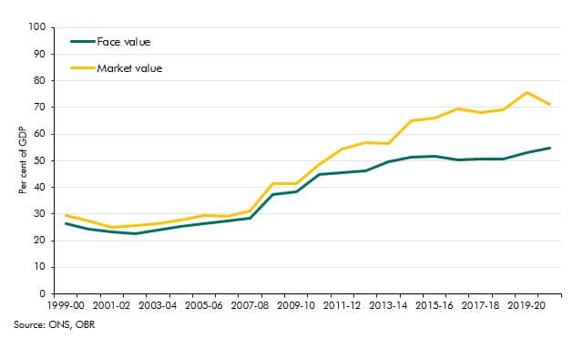
Government debt liabilities can be valued in various ways. In recent years market and face values have diverged sharply reaching 15% of GDP. In this box we explained why this has happened and why we use face value in our analysis.
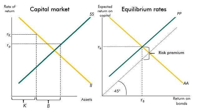
The yields on government debt have declined over recent decades. This box described a stylised model that provides a framework to explain the drivers of these changes.
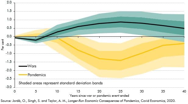
Past pandemics have had long-run impacts on real interest rates. A recent paper found that 20 years after a pandemic real rates fell by, on average, 1.5 percentage points (though less in the UK). This box examined the evidence for the current pandemic and suggested why this time it may be different.
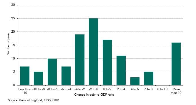
The history of UK government debt can be characterised as one of ‘punctuated equilibria’ in which long periods where the debt-to-GDP ratio is broadly stable or gradually falling are interspersed with occasional large increases in response to major shocks. This box looked at the instances of parge rises since 1900 and the long period of debt reduction after the second world war.
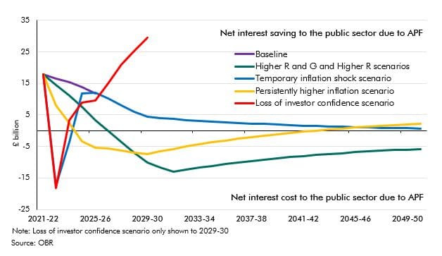
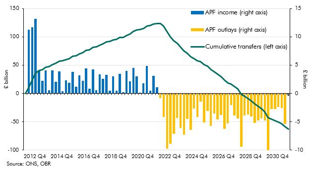
The Asset Purchase Facility (APF) houses the assets purchased by the Bank of England as part of its programme of quantitative easing. This box explained how this lowered interest rates benefitting the Treasury by £113 billion to date but it also increased the sensitivity of interest payments to future rate rises. The box showed how the cash flows to and from the APF change under various scenarios.
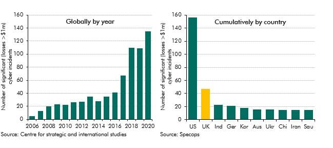
Cyberattacks are a growing global threat that, at the time of writing, had yet to cause sufficient disruption to national infrastructures to generate material economic and fiscal harm. We had not yet quantified the potential fiscal cost from cyberattacks, but included it in our Fiscal risk register for the first time. The box covered some of the potential types of cyberattack, their increasing prevalence and the mechanisms through which they might generate direct and indirect fiscal costs.
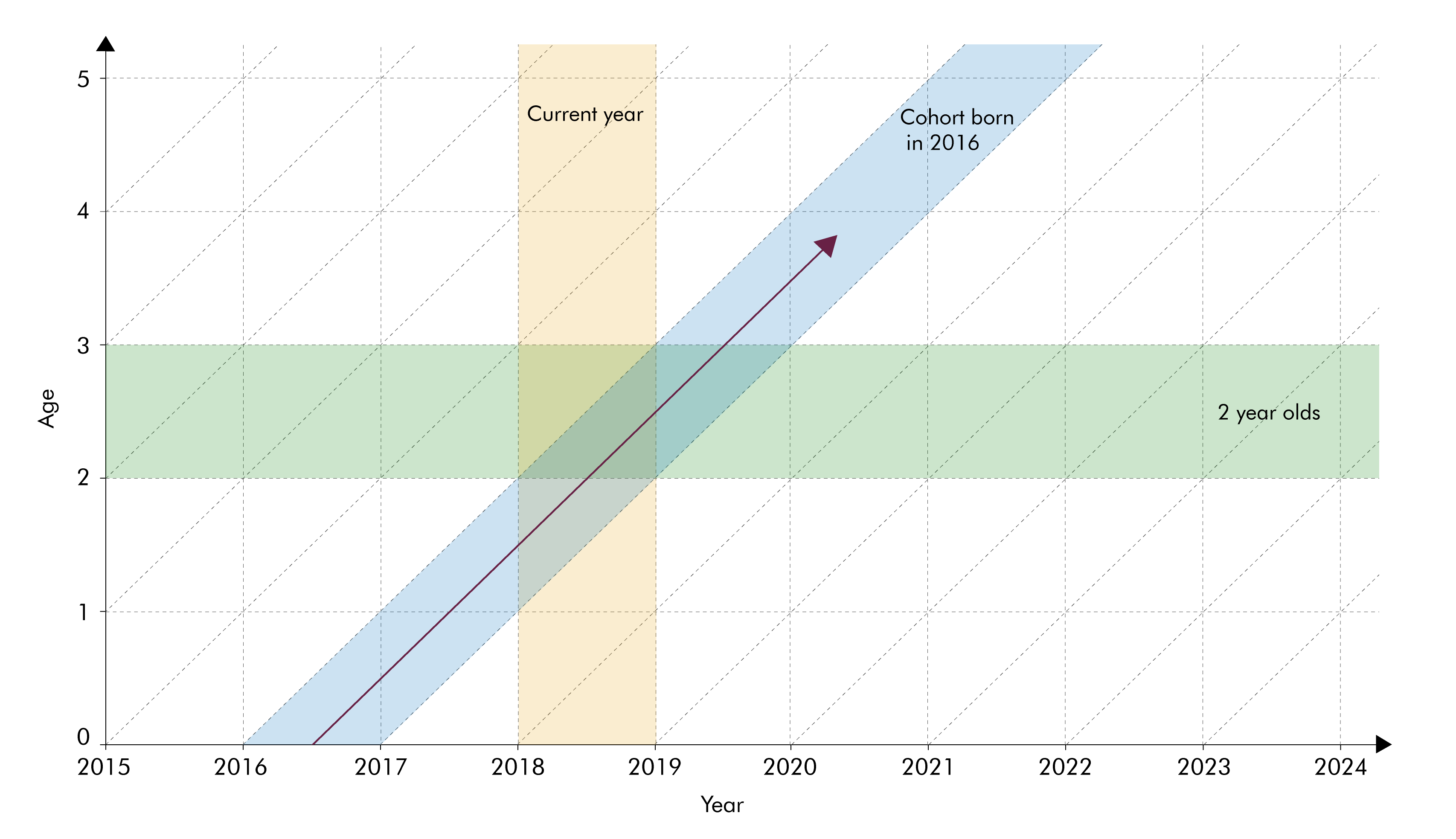
The population projections used to produce our long-term fiscal projections are underpinned by projections for age-specific fertility and mortality rates. In this box we considered two different ways of summarising trends in these rates - period and cohort metrics - and discussed their relative advantages.