
The improvements seen in life expectancy and a variety of other health indicators in the UK over a period of several decades have slowed down and - in some cases - partially reversed. This box detailed these changes and compares them to trends in other G7 countries.
This box is based on NHS Digital, Our World in Data, OECD, OBR and WHO data from July 2023 .
Understanding trends in health across countries and over time adds a further level of complexity on top of the challenge of interpreting changes just in the UK. In this box we do not seek to provide a comprehensive assessment, but instead present selected international comparisons of the metrics explored elsewhere in this chapter and draw some tentative conclusions.
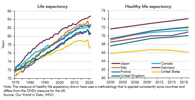
In relation to life expectancy, the left panel of Chart B shows that the slowdown in life expectancy improvements in the 2010s, and sharp reversal during the pandemic, was also seen in most other major developed countries. But, over a longer period, the UK’s relative position has declined, moving below Italy and further away from Japan, France and Canada over the past half century. The right panel of Chart B, which covers a more recent period, shows (using a slightly different metric to that in Chart 2.3 above) that the UK has the lowest healthy life expectancy at birth of any major developed economy bar the US, and had a slower rate of progress over the 2010s than all apart from the US and Canada. Recent analysis by the IPPR suggests that these trends have occurred alongside persistently higher treatable mortality than other G7 countries bar the US.a
Chart B: Life expectancy and healthy life expectancy at birth across G7 economies
Mirroring the picture on healthy life expectancy, Chart C presents the burden of disease, a measure that reflects the years of life spent either with a specific health condition or lost due to that health condition, across G7 countries. It shows that the UK has had the second-highest burden of disease in G7 after the US since 1990, with improvements stalling across most countries since 2010, and the disease burden rising slightly in the US, Canada and the UK in the years immediately prior to the pandemic.
Chart C: The burden of disease across G7 economies
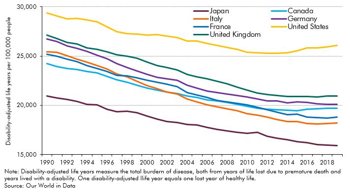
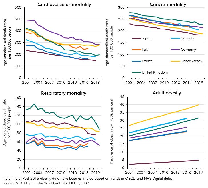
Chart D presents trends in various mortality rates and obesity (which is associated with various chronic conditions, as set out elsewhere in this chapter) since the turn of the century. It shows that:
- Declining cardiovascular mortality has been common across countries, with the UK if anything showing some relative improvement during the 2010s, particularly versus the US.
- The UK has persistently higher mortality rates from cancers and respiratory diseases than other advanced economies,b with similar trends over the past two decades (although there has been a more marked decline in respiratory mortality in the UK over the past few years). Age-specific data suggest rates of improvement in cancer mortality for adults under 50 stalled relative to other advanced economies during the 2010s.c
- The UK has higher rates of adult obesity than Germany, France, Italy and Japan, and has seen faster growth in the prevalence of obesity since the turn of the century than all advanced economies bar Japan (from its very low starting point).
Chart D: Incidence of selected health outcomes across G7 economies
Other data paint the UK in a more favourable light, with faster progress on smoking cessation than other advanced economies and below-average suicide rates, for example.d But the tentative conclusion from these international comparisons is that the UK has experienced worse health outcomes than other G7 countries bar the US on a range of metrics during the 21st century, with some signs of a more pronounced slowdown in health improvements in the pre-pandemic years. This conclusion is backed up by a recent cross-country comparison of health systems and outcomes by The King’s Fund, which concluded that “the UK performs substantially less well than its peers – and is more of a laggard than a leader – on many measures of health status and health care outcomes.”e
This box was originally published in Fiscal risks and sustainability – July 2023