
In the 2018 Economic and fiscal outlook we discussed how the unemployment rate – which had fallen to its lowest level since 1975 – may not necessarily give a complete picture of the extent of labour market slack. This box therefore looked at some other measures, some of which suggested there could be more spare capacity than was captured by the unemployment rate at that time and some of which could be used to argue that there was less.
When unemployment is low, employers are generally expected to offer higher wages as they compete over a smaller pool of available workers. Many models for predicting wage growth are based on some form of that ‘Phillips curve’ relationship, with unemployment often measured against its inferred equilibrium and wage growth often adjusted for productivity growth and (expected) inflation. In recent years, however, despite the falling unemployment rate, wage growth has been lower than many of those models would have predicted. There are several possible explanations for why this might be, some of which imply that the Phillips curve has flattened, so that tightening in the labour market generates less upward pressure on wage growth than in the past, whereas others imply that it has shifted so that a given level of unemployment is now consistent with a lower level of wage growth. We discussed some of these in our November 2017 EFO.
Chart A: Spare capacity in the labour market
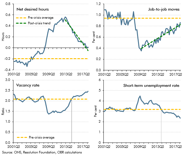
Some commentators have also argued that the unemployment rate on its own does not properly capture the extent of spare capacity in the labour market, so that when a broader concept is used, the past relationship with pay may still hold.a In particular, it is possible that while the unemployment rate served as a good guide to labour market slack in the past, changes to the labour market, including more flexible working patterns and non-standard employment contracts, mean that a full assessment now requires a more complex judgement than simply counting the number of people in and out of work. Chart A shows four such indicators, two of which point to more spare capacity than is captured by the unemployment rate and two of which can be used to argue that there is less:
- Since early 2013 net desired hours have fallen, so that workers now report that they are roughly working the hours that they want (top-left chart). Around two-thirds of that fall has come from part-time and self-employed workers, who are now demanding fewer additional hours, with the rest coming from full-time workers, who on average want to reduce the number of hours they work by less than they did before. Simply continuing the recent downward trend in net desired hours would imply that they would reach their pre-crisis average towards the end of next year. If this is viewed as a steady state, it would suggest that there is still some spare capacity in the labour market according to this measure. One possible measure of underemployment – which takes account of these extra desired hours, as well as the number of people looking for a job – rose by more than the headline unemployment rate during and after the financial crisis, reflecting companies’ decisions to cut hours as well as staff numbers in response to reduced demand. But as net desired hours have since fallen back, the two are now very similar.b
- Labour market flows can also be informative regarding the extent of labour market slack. Workers are less likely to move between jobs voluntarily when there is a lot of spare capacity – for example, because firms will generally be doing less hiring so that there are fewer opportunities, or because last-in first-out employment practices mean moving often involves less job security. Job-to-job moves did fall after the crisis and have since started to recover, although they are still below the pre-crisis average. Again, that suggests some remaining spare capacity (top-right chart). Simply continuing the recent trend (as above) would imply that job-to-job moves would not return to their pre-crisis average until 2021. The wages of employees who remain in the same job may be less affected by the amount of spare capacity in the economy, so a persistent fall in the number of people moving jobs could also affect the nature of the relationship between unemployment and wages. Pay growth among those who have changed jobs recently has been elevated compared with those who have not, which is consistent with this interpretation.c Labour market flows data also show that in recent years it has been fewer people losing their jobs, rather than more unemployed people finding jobs, that has driven the unemployment rate down.
- The number of vacancies relative to the size of the workforce is used as a proxy for how many positions businesses would like to fill relative to the pool of available workers. The number of vacancies per person in the workforce rose above its pre-crisis average in mid-2014, earlier than the unemployment rate reached its pre-crisis average (bottom-left chart). This could have been interpreted as indicating there was less slack in the labour market. But, since then, vacancies have continued to rise, without a material pick-up in wage growth, suggesting that the steady-state number of vacancies may now be higher than in the pre-crisis period. That might, for instance, have reflected the increased ability to advertise positions cheaply though online recruitment sites. But if the number of vacancies per worker continues to rise, that could indicate a genuine tightening in the labour market.
- Within the stock of unemployed people, the length of time that they have been without work can also have important implications for the expected path of wages, with the short-term unemployed on average likely to be more easily substitutable for existing workers and therefore likely to put the most downward pressure on wages. The short-term unemployment rate fell below its pre-crisis average in mid-2014 and has continued to fall since (bottom-right chart). This implies that the long-term unemployed make up a higher-than-usual proportion of total unemployment, which might point to a tighter labour market.
While all four measures show that the labour market has been steadily tightening since the trough of the recession that followed the financial crisis, they give somewhat conflicting messages about the absolute margin of slack in the labour market at the current juncture. In forming our assessment of the equilibrium unemployment rate (and with it the level of potential output in the economy), we have drawn on the signals provided by all four measures.
This box was originally published in Economic and fiscal outlook – October 2018