Our Welfare trends report (WTR) examines the drivers of welfare spending.
In this WTR, we focused on working-age incapacity benefits. It covers the history of incapacity benefits and incapacity benefit onflows and off-flows since 2010.

"It is the duty of the Office to examine and report on the sustainability of the public finances"
Our Welfare trends report (WTR) examines the drivers of welfare spending.
In this WTR, we focused on working-age incapacity benefits. It covers the history of incapacity benefits and incapacity benefit onflows and off-flows since 2010.
The Office for Budget Responsibility (OBR) was created in 2010 to provide independent and authoritative analysis of the UK’s public finances. In December 2013, the Government asked the OBR to take on additional responsibilities in relation to its newly announced cap on a subset of welfare spending. This request was in two parts: to assess the Government’s performance against the welfare cap and to “prepare and publish information on the trends in and drivers of welfare spending within the cap”, so as to facilitate open and constructive debate. Parliament formally included these requirements in the October 2015 edition of the Charter for Budget Responsibility. The January 2022 update to the Charter reduced the frequency with which our Welfare trends report (WTR) must be published from once a year to once every two years.
We have explored several issues in our successive WTRs, ranging from a broad historical sweep of trends in UK welfare spending and international comparisons of welfare spending in our first two reports; to topics including universal credit, disability benefits, the Summer Budget 2015 welfare spending cuts, and changes in welfare spending during and after recessions, across our subsequent six reports. With health-related economic inactivity and health-related benefit caseloads having grown substantially in recent years and the latter projected to rise further over our latest medium-term forecast, this ninth WTR focuses on incapacity benefits spending over the past half-century, and the drivers of changing incapacity benefits caseloads over the past 15 years in particular.
This WTR was initially scheduled for publication on 2 July. Due to the general election that was announced on 22 May and took place on 4 July, we postponed its release to 10 October. This delay did not alter the content of our report.
The analysis in this report represents the collective view of the OBR’s Budget Responsibility Committee. We take full responsibility for the judgements that underpin it and for the conclusions we have reached. We have, of course, been supported in this by the full-time staff of the OBR, to whom we are enormously grateful, as we are to officials in the Department for Work and Pensions that have provided their help and expertise. We are also grateful to external stakeholders who gave their time and shared their expertise. In particular, we would like to thank Ben Baumberg-Geiger at King’s College London, Tom Pollard and Sam Tims at the New Economics Foundation, Kayley Hignell at Citizens Advice, Tony Wilson at the Institute for Employment Studies, Deven Ghelani at Policy in Practice, Christina Beatty at Sheffield Hallam University, Iain Porter at the Joseph Rowntree Foundation, and Declan Gaffney.
As with all our reports, the WTR remains a work-in-progress. We would be pleased to receive feedback on any aspect of the content or presentation of our analysis. This can be sent to [email protected].
In line with our Memorandum of Understanding, we provided a final copy of this report to HM Treasury two working days in advance of publication.
The Budget Responsibility Committee
Richard Hughes, Professor David Miles CBE and Tom Josephs
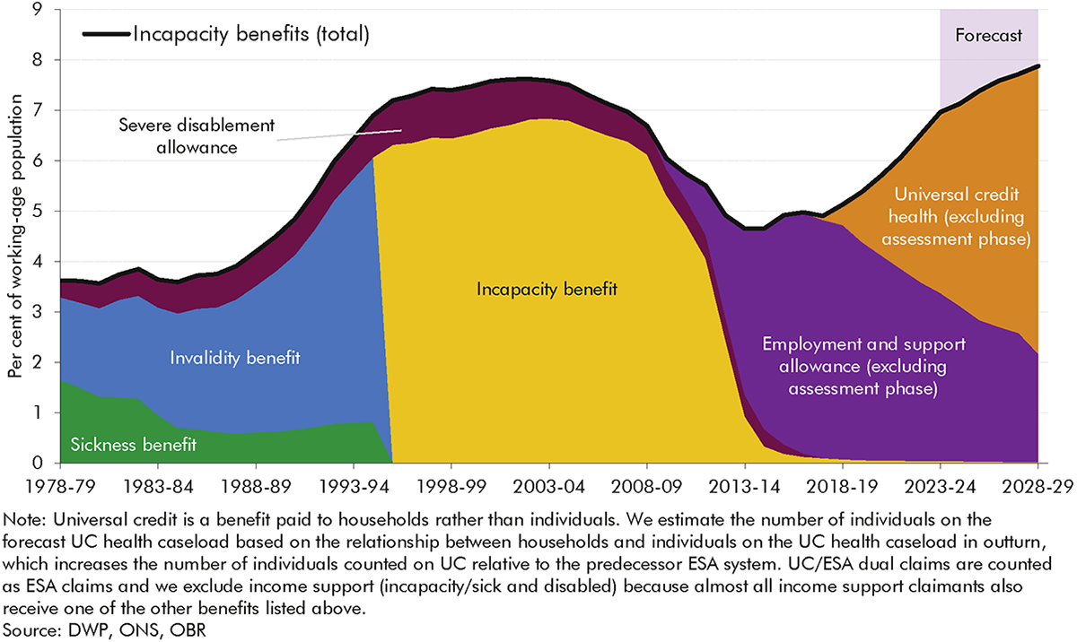
1 Incapacity benefits – income-replacement benefits for people of working age who have difficulty performing day-to-day activities due to ill health – have moved into sharper focus in recent years.[1] Significant increases in both caseloads and spending on these benefits have prompted a series of new policies partly designed to arrest and reverse this. The proportion of the working-age population in receipt of an incapacity benefit reached a post-financial crisis high of 7.0 per cent in 2023-24 and is forecast to reach an all-time high of 7.9 per cent in 2028-29. This reverses the steady decline in caseload prevalence from the early 2000s to mid-2010s. There have also been two major reforms to the structure of incapacity benefits over this period, with the introduction of employment and support allowance (ESA) in 2008 and the gradual rollout of universal credit (UC) replacing income-related ESA (and five other working-age, means-tested benefits) from 2016. In light of these trends and developments this year’s Welfare trends report:
2 Incapacity benefits caseloads (Chart 1) have cycled through periods of growth and decline since the late 1970s. Over this period, there have been four distinct policy regimes:
3 The history of incapacity benefits over the past half century shows that a range of factors combine to drive changes in caseloads and spending, falling into three broad categories: changes in population health; changes in the labour market and wider economy; and changes in the benefits system. The third of these relates in part to changes to the structure of incapacity benefits themselves, such as the assessment regime and the degree of conditionality. But it also relates to these benefits’ interactions with wider welfare policy, including the relative generosity and work-search requirements associated with unemployment benefits, and the overall level of spending on other parts of the working-age welfare system (which has sometimes moved inversely with incapacity spending). The rest of the report looks in greater depth at the role that changes in the benefits system have played in driving incapacity benefits caseloads and spending over the past 15 years, focusing on claimants’ journeys onto and off these benefits.
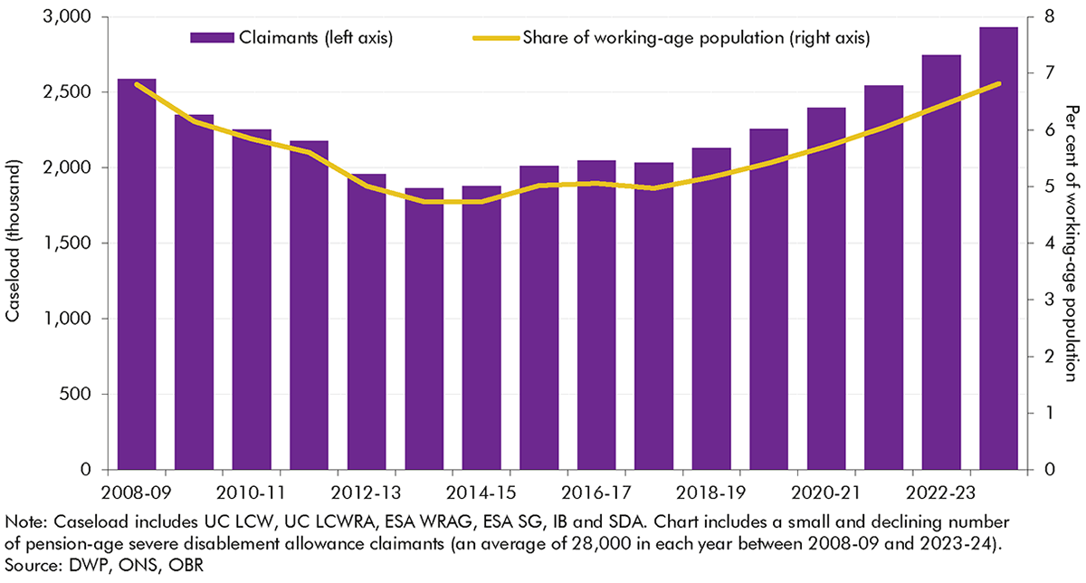
4 Between 2008-09 and 2023-24 the incapacity benefits caseload (combining IB, ESA and UC) increased by 340,000 (13.2 per cent), the net result of it falling, levelling off, and then rising in roughly five-year intervals over this period. A large part of the 330,000 fall between 2008-09 and 2019-20 reflects falling prevalence among the under-60s. This was partly offset by increases in the state pension age in this period, particularly for women, which extended eligibility into ages at which people are more likely to claim incapacity benefits. Since 2019-20, incapacity benefits receipt rates have risen near-uniformly by around 2 percentage points across all age groups, pushing up the caseload by 670,000.
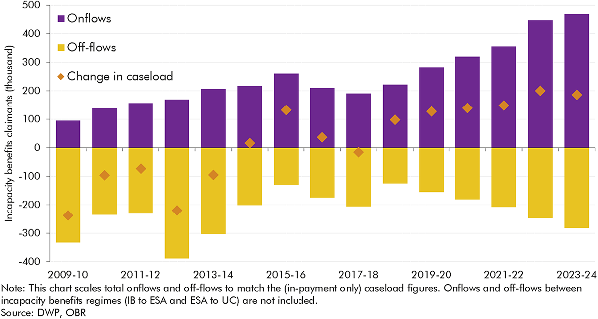
5 To understand the factors underlying incapacity benefits caseload trends since 2010, Chart 2 decomposes annual changes in the caseload into the contributions of annual onflows (purple bars) and off-flows
(yellow bars, shown as negatives), with the annual caseload change (orange diamonds) being the sum of the two. It shows, for example, that relatively high volumes of annual off-flows drove the falling caseload in the early 2010s, while caseload increases since 2018-19 are explained by the growth in onflows outstripping the growth in off-flows.
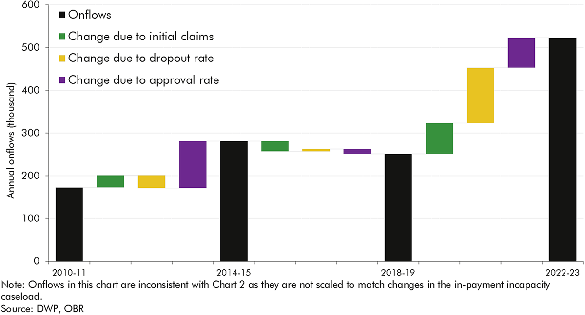
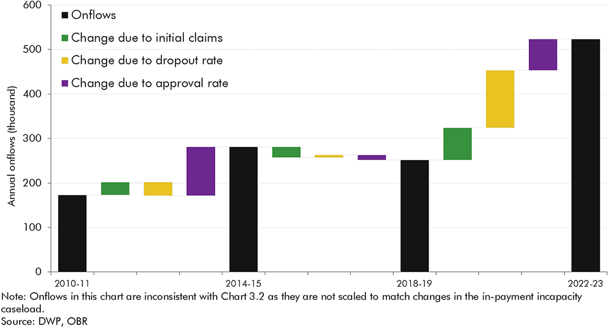
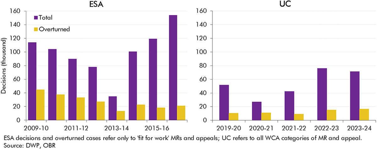
6 Changes in onflows can be further decomposed into three stages of the claims process: the volume of initial claims submitted; the dropout rate (the share of claims that are withdrawn prior to reaching a WCA decision); and the approval rate (the share of WCA decisions that deem a claimant to have more or less severe incapacity). Chart 3 decomposes changes in onflows between three different points in time into these factors. It shows that, of the overall rise in annual onflows between 2010-11 and 2022-23, only a minority (20 per cent) is due to a higher number of initial claims, with 30 per cent of the rise due to lower dropout rates and just under 50 per cent due to the increase in approval rates.
7 Overall caseloads depend not only on onflows but also on off-flows. To understand how initial claims, dropouts, approval rates and off-flows have contributed to caseload changes, we focus on three distinct periods: the early 2010s period of declining caseloads, the later 2010s period of stable caseloads, and the post-2018 period of increasing caseloads.
8 The falling caseload (by an average of 145,000 a year) in the early 2010s was largely the result of comparatively high off-flow rates – which spiked during 2012-13 – alongside lower but gradually rising onflows:
9 The more stable caseload (which rose by an average of around 50,000 a year) in the late 2010s was the result of relatively consistent onflows and off-flows, with the former at a slightly higher level on average. This represents a relatively rare period of stability in the incapacity benefits regime over the past half century. Almost all of the caseload was on the same benefit (ESA), assessments and reassessments did not experience any significant operational changes, and there were no major external shocks.
10 The rising caseload (by an average of 160,000 a year) since 2018-19 reflected the growth in onflows outstripping the growth in off-flows amid the move to UC for all new claims, and the disruption of the pandemic and its aftermath:
11 The analysis in this report, and particularly the detailed examination of flows onto and off incapacity benefits in recent years, provides a range of insights for our future forecasts. Recent trends reinforce the importance for our forecast of assessing all three of the key historical drivers of incapacity benefits caseloads and spending – working-age population health, the state of the labour market, and the structure of the benefits system. But several of the findings in the analysis particularly highlight the importance of the policy and operational features of the benefits system.
12 One of the most significant is that only a minority of the recent rise in incapacity benefits onflows reflects a higher number of people initiating claims. Changes in what happens after that as claimants move through the system – the number who drop out of the process and the final approval rate – have had larger effects. We cannot be certain about the drivers of these effects, but it is likely that they are at least in part due to the different rules under UC relative to ESA that allow claimants to do some work during the assessment phase without having to terminate claims, and the changes to the processes for verifying and handling fit notes during Covid that were subsequently adopted as the business-as-usual approach. They may also reflect changes in the characteristics of claimants such as the type and severity of their health conditions. In terms of off-flows, it is only reassessments that appear to have substantially changed caseload trends, in particular in the early 2010s. There is inconclusive evidence in relation to the effects on off-flows of employment programmes for incapacity benefits claimants.
13 These features of the incapacity benefits system have interacted with changes in the non-incapacity parts of the system, and wider health and economic trends, to drive recent incapacity caseloads and spending. And our broader historical sweep shows that, over the past half century, the incapacity benefits system has rarely reached any kind of steady state, making the basis from which to forecast future trends highly contextual and uncertain.
14 These and other insights provide areas for further research or information that will help inform future forecasts. The report identifies areas for improved data, in areas such as UC incapacity claimants’ primary health condition; claimants’ employment and benefit circumstances at the point of onflow; claimants’ off-flow journeys into work or elsewhere; and claimants’ interactions with health services.
15 The report also identifies risks to our forecasts that we will scrutinise in more depth in future. We plan to conduct greater scrutiny of our incapacity onflow and off-flow assumptions, working with DWP analysts. We will also ask DWP to monitor population health data in addition to incapacity caseload data to judge if our onflow assumptions remain central. And we will more closely scrutinise DWP’s operational provider performance, particularly in relation to reassessments, and delivery of employment support programmes when making decisions about the path of incapacity benefits caseloads.
1.1 Our biennial Welfare trends reports (WTRs) examine trends in working-age and pensioner benefits and tax credits. This year’s report focuses on working-age ‘incapacity benefits’ – defined as the various income-replacement benefits that have been available over the past half century for people who find it difficult to work due to ill health.[4]
1.2 This part of the welfare system has undergone major reform twice within the past 20 years and recently has experienced a significant increase in claimants. Employment and support allowance (ESA) replaced incapacity benefit (IB) in 2008. From 2016, universal credit (UC) began to replace new claims for income-related ESA (and six other working-age, means-tested benefits and tax credits).[5] The post-pandemic period has seen a rapid increase in claims for the health-related elements of UC alongside rising economic inactivity due to sickness. As a result, we have repeatedly made large upward revisions to our forecasts for incapacity benefits since March 2022.[6] Our most recent forecast from March 2024 projects the proportion of the working-age population in receipt of an incapacity benefit reaching an all-time high of 7.9 per cent by 2028-29.
1.3 This report explores the potential drivers of this increase, with a focus on how changes in the operation of the incapacity benefits system may have contributed to trends in incapacity benefits claims, particularly in the period since 2010. In this chapter we introduce the metrics and methodological approach that we use to analyse the evolution of incapacity benefits over time. To provide context for the subsequent analysis we then briefly introduce trends in incapacity benefits caseloads and spending over the past 45 years.
1.4 Our WTRs focus on those elements of benefit and tax credit spending that are financed by central government as part of what the Treasury calls ‘annually managed expenditure’ (AME). Most are administered by three central government bodies:
1.5 The welfare system contains several benefits that aim to support people affected by sickness or disability. The main distinction we draw within these is between two categories of benefit, which can be claimed at the same time.[8]
1.6 This report focuses on incapacity benefits because we covered disability benefits in our January 2019 WTR.[11] That report showed that the prevalence of working-age disability benefits has grown steadily since the introduction of DLA in 1992, related to the growing prevalence of self-reported disability, broadening eligibility criteria, and higher take-up. By contrast, the incapacity benefits caseload has been somewhat cyclical. The prevalence of incapacity benefits grew rapidly in the late 1980s and early 1990s before falling in the mid-2000s, and starting to grow again after 2017-18, with the growth rate accelerating after the pandemic. These varying trends in incapacity benefits reflect changes in health, the labour market, and the structure of the welfare system – a more complex set of drivers than extra-cost disability benefits. We briefly summarise these trends and their drivers below.
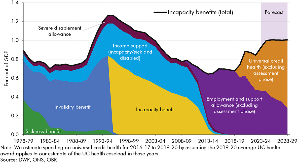
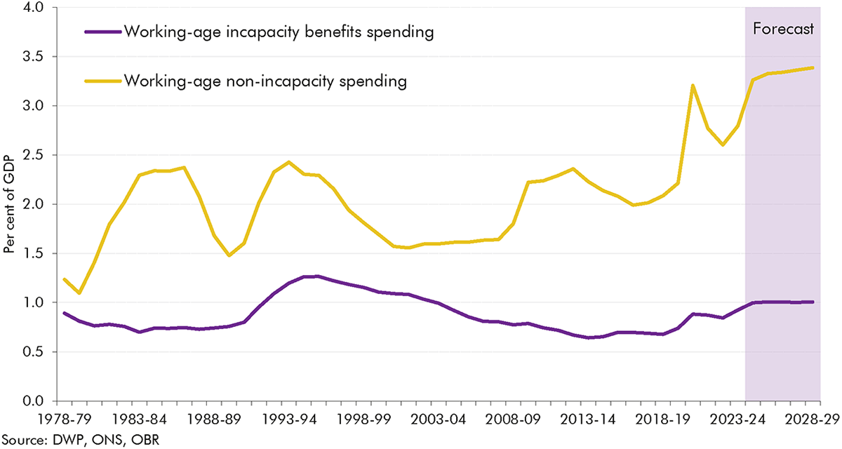
1.7 Chart 1.1 presents spending on incapacity benefits as share of GDP over the past half century (as we discuss below, this is clearly a partial picture of the working-age welfare system, with trends in non-incapacity spending being quite different, particularly in recent decades). It highlights a series of overlapping dynamics between economic, health, and benefit system changes over four distinct periods:
1.8 Incapacity benefits caseloads have been a key driver of the trends in incapacity benefits spending as a share of GDP discussed above. Chart 1.2 shows that the proportion of the working-age population in receipt of an incapacity benefit increased sharply from the mid-1980s through to the mid-1990s, fell from the mid-2000s through to 2013-14, and has risen consistently since 2017-18. It reached a post-financial crisis high of 7.0 per cent of the working-age population in 2023-24. While instructive overall, these trends over long time periods have to be interpreted with some caution, given the different ways in which different benefits classify people over time. Most importantly, as a household benefit UC includes some partners of claimants in the incapacity benefits caseload, thereby increasing the number of individuals ‘counted’ as on the benefit relative to the predecessor ESA system.[13]
1.9 Our March 2024 forecast assumes that incapacity benefits prevalence will continue to increase over the next five years, albeit at a slower rate from 2026-27, and reach an all-time high of 7.9 per cent in 2028-29. This is based on a judgement that part of the recent strong growth in incapacity benefits caseloads has been driven by cost-of-living pressures driving up applications and take-up, meaning growth rates will slow as real household disposable incomes recover.[14] Despite this forecast rise in caseload prevalence, our forecast for incapacity benefits spending as a share of GDP stabilises after 2024-25 (Chart 1.1). This is because nominal GDP is forecast to rise faster than CPI inflation (the policy assumption for benefit uprating).[15]

1.10 Trends in incapacity benefits spending and caseloads have been driven by three broad factors: changes in the health of the working-age population; changes in the labour market and wider economy; and changes in the benefit system. It is hard to isolate the exact contributions of these factors to overall trends because changes in each have often happened simultaneously, as previous OBR work (and a wealth of external analysis) has explored. Taking each of the factors in turn:
1.11 We explored the health and economic drivers of incapacity benefits caseloads in detail our 2023 and 2024 Fiscal risks and sustainability reports. While this report discusses the role of all three of the above factors, it focuses in particular on aspects of the third – exploring in detail how changes in the operation of the incapacity benefits system have shaped recent trends in caseloads. Within this we focus on the period since 2010 following the introduction of ESA, which was then followed by the introduction of UC. This is a period for which we have more complete data and so can explore in detail the role of onflows, off-flows, and the journey of claimants through the benefit system, in driving caseloads.
1.12 The remaining chapters of this report look at the history of incapacity benefits in Great Britain since the 1970s and explore trends in claims, assessments, and outcomes since the introduction of ESA in 2008 in greater detail. The report is structured as follows:
2.1 This chapter describes how the incapacity benefits system has evolved in Great Britain over the past half century, focusing on caseloads. We look in detail at what has driven trends in invalidity benefit (IVB) and incapacity benefit (IB) caseloads between the late 1970s and 2008. We also discuss the main trends in employment and support allowance (ESA) and universal credit (UC) caseloads after 2008, but Chapter 3 provides a more detailed decomposition of these.
2.2 There have been four main incapacity benefits since the introduction of invalidity benefit in 1971: invalidity benefit, incapacity benefit, employment and support allowance and universal credit. Table 2.1 describes the basic features of each benefit, and the following sections describe each in greater detail. In summary, the key factors in the transition from each iteration of the system to the next have been to tighten the assessment gateway to receive the benefit, reduce generosity for certain groups, move away from awards based on age and duration towards relative fitness for work, and more recently to introduce elements of conditionality.
2.3 In addition to these four main benefits, in some periods claimants have been able to receive other benefits related to incapacity. In brief these operated as follows:
| Contributory/ means-tested | Assessment regime | Assessment outcomes | Awards | Conditionality | |
|---|---|---|---|---|---|
| Invalidity benefit (1971-1995) | Contributory | GP assessment (focused on the ability to carry out only “suitable work”) | Two outcomes: either deemed eligible or not | Awards were higher for younger groups. Additions were paid for adult dependants and an earnings-related element was introduced from 1985. Benefit was only paid after 28 weeks, when sickness benefit/statutory sick pay terminated | No conditionality |
| Incapacity benefit (1995-2008) | Contributory, but became partially means-tested over time | All work test (expanded to focus on ability to do any job), replaced by the personal capability assessment in 2000 (tighter eligibility criteria and an assessment of capabilities despite medical condition) | Two outcomes: either deemed eligible or not | Generosity decreased relative to IVB via the removal of the earnings-related element, less generous age-related additions and the introduction of lower award rates for durations below 52 weeks | No conditionality |
| Employment and support allowance (2008- present) | Contributory and means-tested elements | Work capability assessment (a greater focus still on capability for work rather than benefit entitlement) | Three outcomes: fit for work; plus two different groups tiered according to the severity of health conditions and their effects on ability to work (less severe incapacity: work-related activity group; more severe incapacity: support group) | Age-related and adult dependency additions were abolished. Awards based on assessment outcome, with higher payments for the more severe incapacity group, and the generosity of the less severe incapacity group reduced (to be equal to unemployment-related benefits) in 2017 | Some conditionality (work-focused interviews) for the less severe incapacity group |
| Universal credit (2016-present) | Means-tested | Work capability assessment (as in ESA) | As in ESA (although groups go under different names; less severe incapacity: limited capability for work; more severe incapacity: limited capability for work and work-related activity) | As in ESA, although disability premiums were restructured and UC awards are typically lower for those who received the severe disability premium on ESA | As in ESA |
2.4 Invalidity benefit, made up of invalidity pension and invalidity allowance, was introduced in 1971 alongside the existing short-term sickness benefit. It was designed to provide more generous support for those with an inability to work for longer than 28 weeks. It was contributory and so provided support to those with sufficient National Insurance credits, while those without sufficient contributions received SDA, often alongside income support to top up incomes. The medical assessment focused on the ability to conduct “suitable work” and was carried out by GPs.[16]
2.5 Chart 1.2 in the previous chapter showed that overall incapacity benefits caseload prevalence among the working-age population rose sharply from 1978-79 to 1994-95, from 3.6 per cent to 6.9 per cent (detailed caseload data is not available before 1978-79). It also shows that prevalence for IVB alone more than tripled over this period, from 1.6 per cent to 5.3 per cent. Chart 2.1 shows IVB (and SDA) caseload prevalence by age for men and women over this same period. It shows:
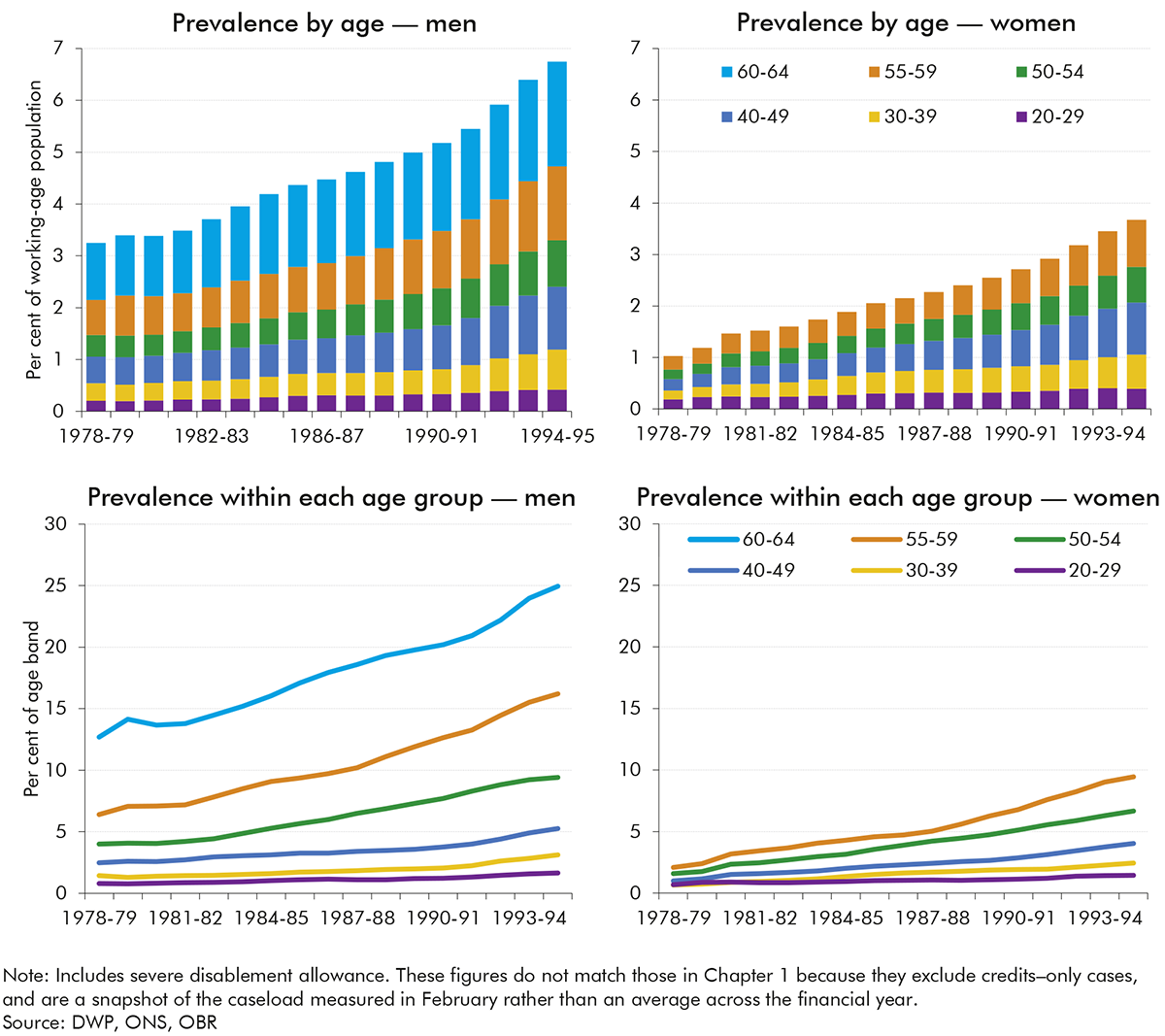
2.6 There is broad agreement across the literature that the increase in male IVB prevalence during the 1980s and early 1990s primarily reflected structural changes in the labour market, rather than changes in underlying health.[17] A number of studies have shown that in labour markets with reduced demand, men with underlying health conditions were more likely to exit jobs, usually onto incapacity benefits, whereas in stronger labour markets those with underlying conditions would continue to work.[18] For example, a study looking specifically at labour market adjustments in the British coalfields, where 160,000 jobs were lost and only a quarter of these replaced, found that the largest adjustment was older workers moving onto incapacity benefits, with very little change in unemployment.[19] Similar patterns were seen in areas where labour supply outstripped demand, such as in response to increases in the number of women participating in the labour market.[20] For these reasons, incapacity benefits caseloads in these periods were often described as a form of ‘hidden unemployment’.[21]
2.7 Compounding these labour market-related drivers, from the mid-1980s onwards, several policy factors seem to have channelled more individuals into incapacity benefits rather than unemployment benefit:
2.8 Incapacity benefit was introduced in April 1995 to replace IVB and sickness benefit for both new and existing claimants, with the differences between the two summarised in Table 2.1 above. Like IVB, IB was a contributory benefit and so required sufficient national insurance contributions, although the contributory principle was weakened with the abolition of non-contributory SDA for new claimants in 2001 and its merger into IB. The transition to IB reduced generosity via fewer and less generous age-related additions and the introduction of three different rates linked to the length of incapacity, as set out in Table 2.1 (although some claimants were eligible for income support as a means-tested top-up). The caseload for those claiming the disability premium of income support increased by two-thirds between 1995-96 and 2007-08, while spending on disability premiums increased by 57 per cent over the same period.
2.9 The transition to IB also tightened eligibility via the introduction of a medical eligibility test, known as the ‘all work test,’ which assessed claimants’ capability for work against a defined set of criteria. The all work test was initially conducted by the claimant’s GP, then from 1998 onwards began to be outsourced to the commercial sector. In 2000 it was replaced by the personal capability assessment (PCA) which included an additional ‘capability report’ intended to outline what a claimant could do despite their medical condition.
2.10 Chart 1.2 in the previous chapter showed that overall incapacity benefits caseload prevalence among the working-age population fell modestly between 1995-96 and 2007-08, from 7.9 per cent to 7.0 per cent. Chart 2.2 shows this prevalence for IB (and SDA) from 1999-00 onwards, disaggregated by age and gender (we cannot consistently disaggregate by age and gender prior to 1999-00 because the necessary data is not available for some parts of the caseload). They key trends are as follows:
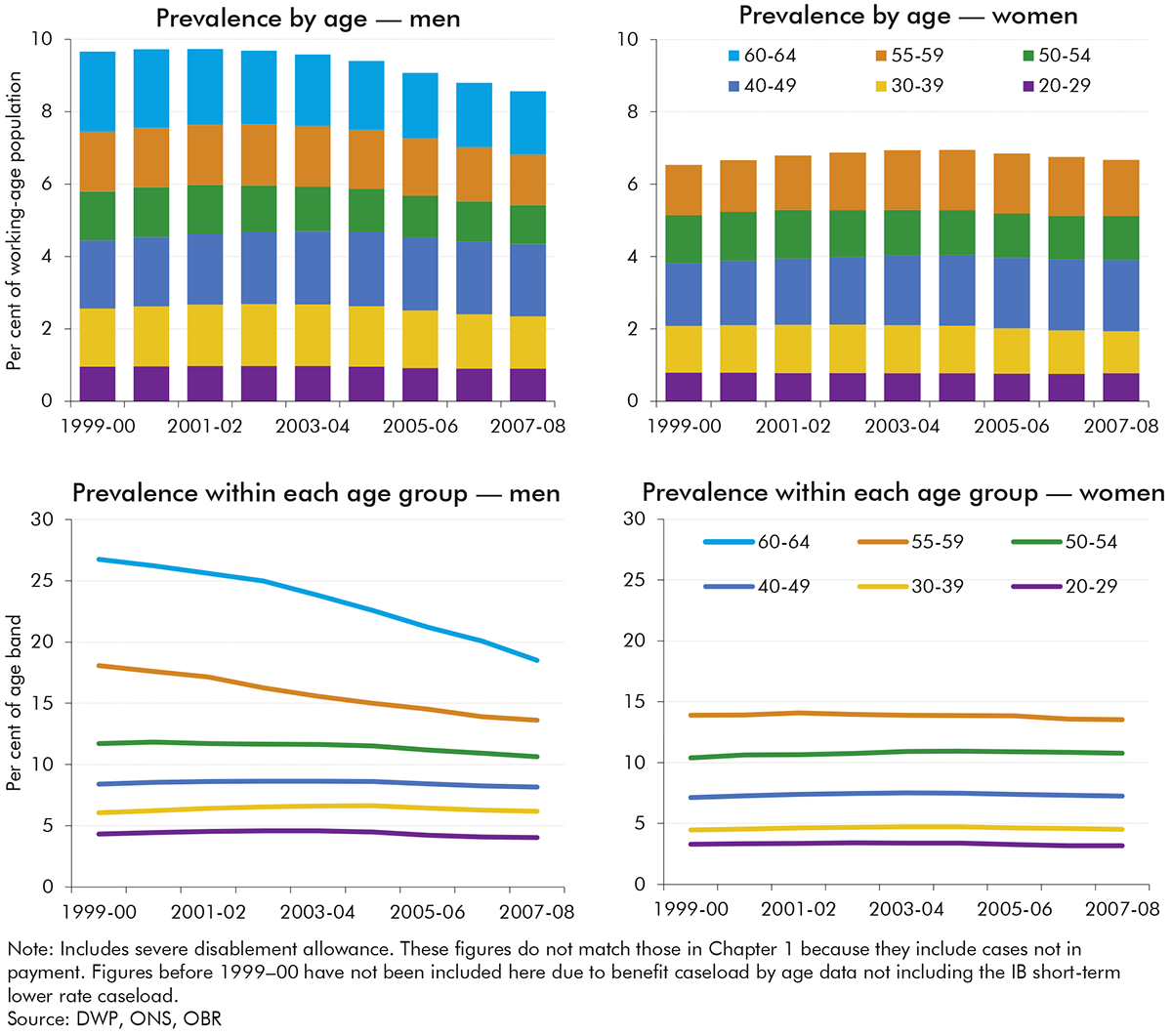
2.11 The gradual decline in caseload prevalence during this period is generally thought to have been driven by the combination of:
2.12 Employment and support allowance was introduced for new claims in October 2008 to replace IB. ESA could be claimed on both a means-tested and contributory basis. ESA was only introduced for new claims leaving a substantial stock of IB claimants who gradually either left or moved to ESA (IB claimants began to be reassessed for ESA after October 2010).
2.13 The principal difference between IB and ESA was the introduction of the work capability assessment (WCA), which replaced the PCA within incapacity benefit (see Table 2.1). In a 2006 White Paper on welfare reform, the then Government stated that this revised WCA was intended to be “assessing people’s capability for work rather than just their entitlement to benefits”.[26] The WCA could either deem a claimant fit for work (FFW), or place them in either the work-related activity group (WRAG) or support group (SG), depending on their ability to work. Unlike IB claimants who generally did not face any conditionality, WRAG claimants were expected to engage with a personalised programme of back-to-work support.[27]
2.14 Chart 1.2 in the previous chapter showed that overall incapacity benefits caseload prevalence among the working-age population fell slightly between 2008-09 and 2015-16 – from 6.7 per cent to 4.9 per cent. Chart 2.3 shows the same caseloads by age for men and women. The key trends are:
2.15 The modest fall in the prevalence of incapacity benefits receipt over this period was driven by a notable increase in off-flows, partly from reassessing the IB caseload under the stricter ESA WCA, as discussed in further detail in Chapter 3. As mentioned above, this was partly offset by the rising female state pension age expanding eligibility into ages at which people are more likely to claim incapacity benefits (see Box 3.1 in the following chapter for a fuller discussion).
2.16 Universal credit began to replace income-related ESA from May 2016, and became the benefit for all new claims from December 2018.[28], [29] As of 2023-24, there are still 0.7 million legacy income-related ESA claimants, compared to 1.6 million claimants on health-related UC.[30] We forecast this will gradually fall as some claimants choose to move to UC and the Department for Work and Pensions migrates those who do not choose to move.
2.17 Under UC, claimants who report a work-limiting illness or disability continue to undertake a WCA to assess their eligibility for either the limited capability for work (LCW), or limited capability for work or work-related activity (LCWRA) groups. These groups are analogous to those in ESA, so throughout the rest of this report, we refer to the ESA WRAG and UC LCW groups as the ‘less severe incapacity group’ and the ESA SG and UC LCWRA groups as the ‘more severe incapacity group’.
2.18 Unlike the shifts from IVB to IB, and from IB to ESA, the shift from income-related ESA to UC did not entail large changes in the assessment regime or relative conditionality. That said, awards were cut for new claims to the less severe incapacity group in both ESA and UC in 2017 to the same level as that for those found capable to work. This means it is now only the level of work-search requirements relative to unemployment-related claimants within UC that differs for less severe incapacity claimants, which is discussed further in Chapter 3. There are several smaller differences between UC and ESA, especially in terms of the process for initiating a health-related claim and progressing to an assessment, as well as payments being made to households rather than individuals, which are discussed in Chapter 3.
2.19 During the pandemic, the Government implemented several changes to the process of claiming the UC health element and ESA. A significant change to the assessment gateway resulted from the suspension of face-to-face WCAs from 17 March 2020. During this time, paper-based assessments were used, with telephone and video assessments introduced in May 2020. Face-to-face assessments did not resume until May 2021. Reassessments were temporarily suspended, as well as work search conditionality for the less severe incapacity group.
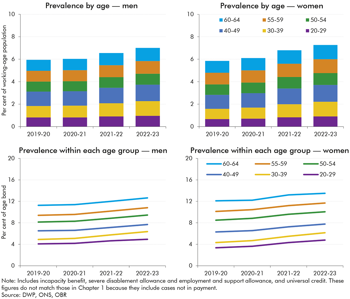
2.20 Chart 1.2 in the previous chapter showed that overall incapacity benefits caseload prevalence among the working-age population rose between 2019-20 and 2023-24 – from 5.4 per cent to 7.0 per cent. Chart 2.4 shows the caseload by age for men and women from 2019-20 to 2023-24,[31] capturing the impact of the pandemic and the gradual introduction of UC. All age-and-gender groups show similar rises to the overall increase in caseload prevalence over this period.
2.21 The rise in the prevalence of incapacity benefits receipt over this period was primarily driven by a rise in onflows outstripping a more gradual rise in off-flows. This is discussed further in Chapter 3, which considers in detail trends since 2010 in incapacity benefits caseloads, decomposing changes in onflows, off-flows, and the claimant journey.
3.1 This chapter describes in detail how the combined universal credit (UC), employment and support allowance (ESA) and incapacity benefit (IB) caseload has changed over the past 15 years. It decomposes changes into:
3.2 The analysis looks in detail at the three steps in a ‘claimant journey’ that result in an onflow: the initial claim; whether a claimant proceeds to an assessment or drops out of the process; and assessment outcomes. This provides new evidence on the drivers of incapacity benefits spending in this period. It also helps to inform our UC forecasting, which operates based on judgements about levels of onflows and off-flows over time.
3.3 For the analysis in this chapter we focus on caseload levels, rather than the caseload prevalence rates (i.e. levels as a share of the working-age population) that we explored in the previous chapters. Chart 3.1 shows that both caseload levels and prevalence rates fell until 2013-14 and grew thereafter, with the pace of growth increasing after 2017-18. The slightly faster rise in levels terms partly reflects increases in the state pension age up to 2020, which expanded the eligible population (see Box 3.1). An important definitional point is that, since 2017, new claims in the less severe incapacity group no longer receive higher awards relative to unemployment-related claimants and those found fit for work at a work capability assessment. In line with the Department for Work and Pensions’ (DWP’s) approach to classifying health-related claims, and reflecting the fact that they still experience fewer work-search requirements, we still count this less severe incapacity group as part of the incapacity benefits caseload after this change (and we discuss its potential effects below).
As shown in Chart A, the total incapacity benefits caseload increased by 330,000 people (12.3 per cent) between 2008-09 and 2023-24. Over this period, the state pension age (SPA) has been rising – from 60 to 65 for women between April 2010 and November 2018, and then from 65 to 66 for both men and women between December 2018 and October 2020.a This box explores the role of the rising SPA in the rising incapacity benefits caseload.
Chart A shows the distribution of incapacity benefits claimants by age and sex in 2008-09 and 2023-24. It shows that of the total 330,000 caseload increase between these two points in time:
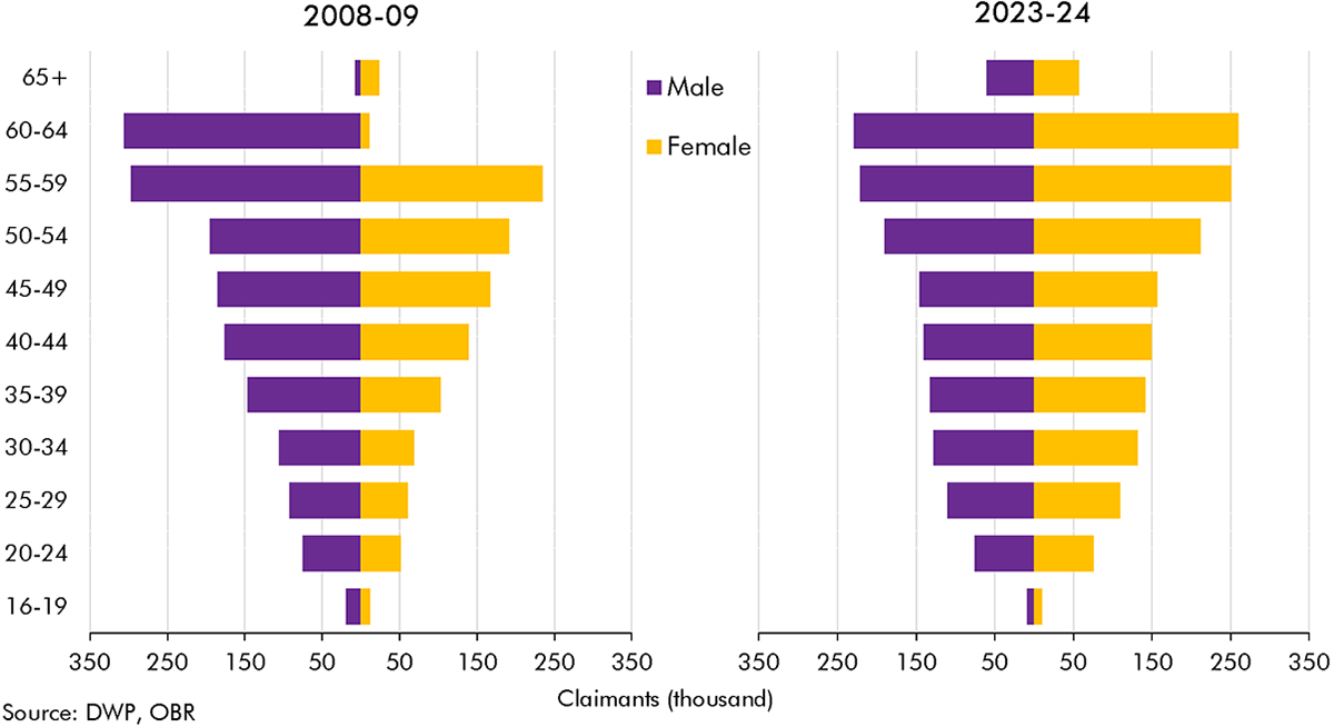
The above breakdown could lead one to conclude that the entirety of the increase in the incapacity benefits caseload since 2008-09 can be attributed to the rising state pension age. However, as discussed elsewhere in this chapter, this period covers a phase in which the incapacity benefits caseload and caseload prevalence was falling – up to around 2014-15; a period in which it was relatively stable – up to the late 2010s;b and a period of rising caseloads since then. Chart B shows caseload prevalence by single year of age, up to the age of 64, at three of these points in time. It shows that:
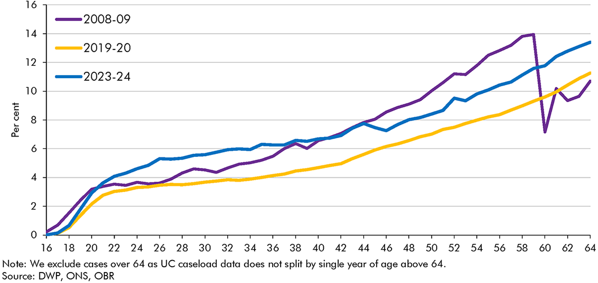
In summary, the falls in the incapacity benefits caseload through most of the 2010s were significantly limited by two age-related factors. First, increases in the state pension age expanded the population eligible to receive incapacity benefits into age groups in which people are much more likely to claim. Second, a shift in the composition of the eligible population towards older working age offset the particularly sharp falls in caseload prevalence at older ages. By contrast, the rising caseload since just before the pandemic appears to have been felt relatively uniformly across the age range, and so cannot be explained by age-related factors.
a) As UC is paid to households, individual claimant age is no longer the sole determinant of eligibility for the UC health element. ‘Mixed-age couples’ on UC (households where one claimant is older than the state pension age and the other is of working age) are treated as ‘working age’ for entitlement to means-tested benefits.
b) We compare to 2019-20 here rather than 2018-19 as above because UC health data by age is not available prior to April 2019.
3.4 These trends in caseloads have been driven by substantial variation in onflows and off-flows over the post-2010 period. Chart 3.2 shows how the net effect of onflows and off-flows in each year results in the overall change in the caseload compared to the previous year, and Chart 3.3 presents onflows and off-flows as shares of the working-age population and the incapacity benefits caseload, respectively. These charts illustrate three distinct phases:

3.5 This section considers the rises in incapacity benefits onflows in greater detail. It focuses on three key aspects: initial claims; claimants who drop out while waiting for an assessment; and assessment outcomes. The subsequent section explores changes in off-flows in greater detail, including changes in reassessments and work entry rates.
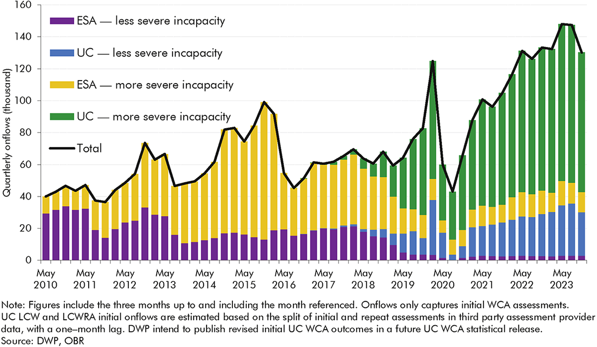
3.6 The previous section described how ESA and UC onflows have tripled from 2010-11 to 2022-23. Looking in more detail, Chart 3.4 shows that quarterly onflows increased by around 90,000 from 40,000 in May 2010 to 130,000 in November 2023.[35] The growth has been much more pronounced in the more severe incapacity group,[36] which made up 77 per cent of onflows in November 2023, relative to 26 per cent in May 2010.
3.7 Chart 3.5 decomposes changes in onflows (necessarily using a broader measure of onflows than our preferred one in Chart 3.2, above[37]) into three stages of the claims process that are described in more detail in Box 3.2 below: initial claims, dropout rates,[38] and approval rates. It shows that of the overall rise between 2010-11 and 2022-23, just over 20 per cent was due to a higher number of people initiating claims, just over 30 per cent was due to lower dropout rates, and just under 50 per cent was due to the increase in approval rates. Looking in more detail at the three time periods discussed in the previous section (paragraph 3.4, above):[39]
3.8 The following section considers changes in these steps in greater detail, exploring the role of the operation of the benefits system (particularly in the transition from ESA to UC), the characteristics of claimants, and broader contextual factors in driving these trends. As background to this analysis, Box 3.2 describes the UC claimant journey in more detail.
There are several stages before a claimant becomes an ‘onflow’ to an incapacity benefit, as detailed in Chart C below. To join either the more or less severe incapacity groups in universal credit, a claimant typically:a
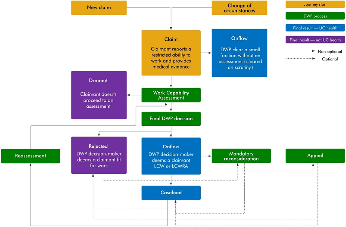
The claimant journey up to the point of onflow in UC differs in some important respects to that in ESA – summarised in Table A. We explore the role these changes may have had in trends in initial claims, dropout rates and assessment outcomes in this chapter.
| ESA | UC | |
|---|---|---|
| Labour market eligibility for referral | Out-of-work benefit | Can be referred for a WCA whilst still in work |
| Statutory sick pay impact on referral | Those receiving statutory sick pay cannot make a claim for ESA | Those receiving statutory sick pay can make a UC health claim |
| Benefit eligibility for referral | JSA claimants with short periods of sickness (up to 13 weeks) would not claim ESA | Claimants who declare a restricted ability to work supported by medical evidence join UC health |
| Length for referral | Claimants are referred ‘immediately’ for a WCA | Unless they meet the Day 1 criteria or have a long fit note, claimants will be considered for referral after 29 days |
| Conditionality awaiting assessment | No conditionality for income-related ESA; tailored conditionality for contributory ESA | Tailored conditionality applies pre-WCA |
| Permitted work rules | Cannot work more than 16 hours and cannot earn more than £183.50 per week | No permitted work rules |
a) This is a stylised representation of a claimant journey and there are exemptions at various stages. For example, not all claimants will be required to undertake a work capability assessment or reassessment.
b) Before issuing a final recommendation, DWP calls the claimant in a ‘decision assurance call’ where they verify details provided at assessment.
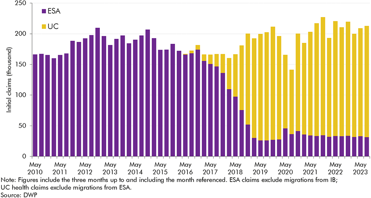
3.9 The number of people initiating an incapacity benefits claim within either ESA or UC health has fluctuated over time,[40] settling at a higher level in recent years than at the beginning of the 2010s (Chart 3.6). The number of initial claims rose a little from 2010-11 (averaging 160,000 per quarter) through to 2014-15 (195,000 per quarter), dipped back close to where they started by 2017-18 (165,000 per quarter), and then rose to a higher level in 2018-19 (185,000 per quarter) and higher still in the years after the onset of the pandemic (reaching 215,000 per quarter in 2022-23). But as Chart 3.5 above shows, this rise in initial claims only explains a minority (20 per cent) of the overall rise in onflows between 2010-11 and 2022-23.
3.10 The factors driving this increase in initial claims are likely to include:
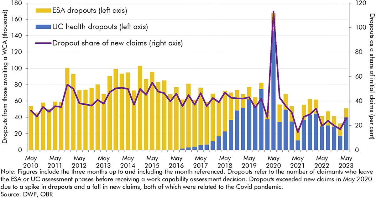
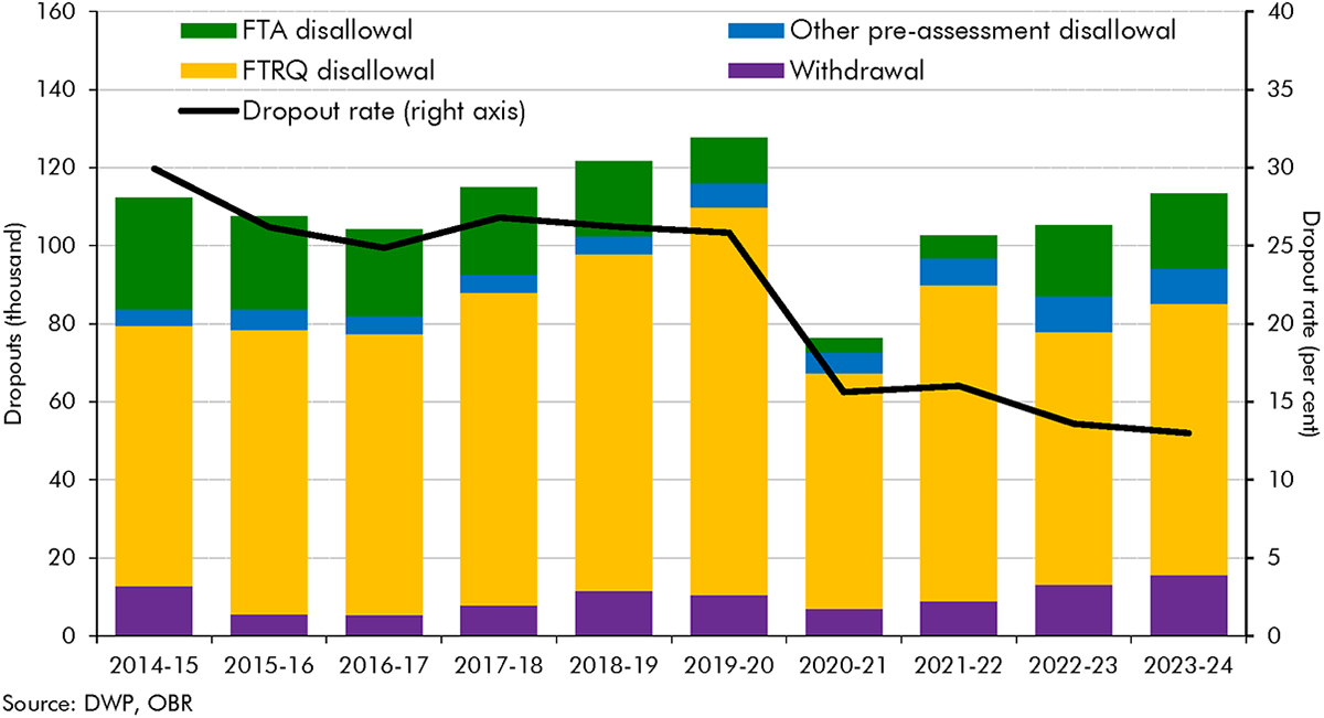
3.11 As explained in Box 3.2, ‘dropouts’ from ESA and health-related UC measure are defined as claimants who exit part-way through the process for claiming ESA or UC health.[42] Up until the full rollout of UC, dropout volumes had a U-shaped increase, rising from 50,000 per quarter in 2010-11 to 90,000 per quarter in 2013-14 before falling halfway back down to 70,000 per quarter in 2016-17. With the introduction of UC, dropouts have fallen sharply, decreasing from 70,000 per quarter in 2018-19 to 40,000 per quarter in 2022-23 (a 43 per cent fall). Dropout rates, measured as a share of new claims, have followed a similar trend to volumes.
3.12 The reasons for the changing dropout rate are not completely clear, but possible factors include:
3.13 The ‘approval rate’ captures the share of claimants reaching an ESA or UC work capability assessment deemed eligible to receive incapacity benefits. The approval rate has increased significantly since the introduction of ESA, rising from 38 per cent in May 2010 to 57 per cent in May 2013 to 79 per cent in November 2019.[47] Following the temporary spike to 96 per cent between August 2020 and February 2021 due to Covid easements, it has remained steady, at around 80 per cent, since early 2021.
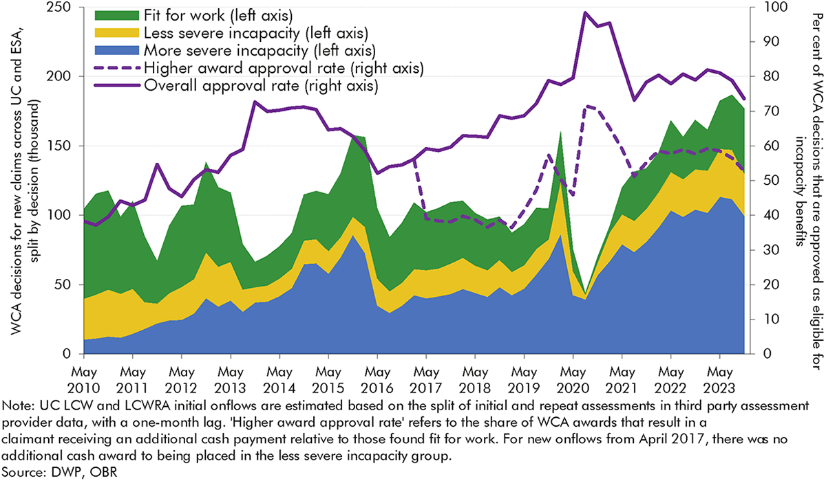
3.14 The following sections explore in more detail the factors that appear to have driven approval rate changes: changes in guidance; changes in assessment provider capacity; and reductions in awards for the less severe incapacity group. We also explore two factors that might be expected to have contributed to changing approval rates but do not appear to have done so: and changes in claimants’ age and conditions; and the introduction of mandatory reconsiderations.
3.15 The DWP has changed the operation of the WCA in response to department-led reviews, independent reviews, and broader public reception. The most notable changes occurred in the early 2010s and had the net effect of expanding the opportunities open to claimants to provide additional evidence, as well as partly expanding eligibility for incapacity benefits via easements to various assessment criteria.[48] This is likely to have contributed to the increase in the approval rate in this period.
3.16 Separate to DWP guidance, as the WCA bedded in and became better understood, external advice on it from organisations like Citizens Advice become more widely accessible to prospective claimants, which may have improved claimants’ chances of being approved.
3.17 Assessment provider capacity is also likely to have affected approval rates. The DWP initially contracted with Atos as the sole supplier of ESA WCAs after 2008. Atos struggled to cope with the volume of WCAs after the introduction of IB reassessments from 2011 onwards, resulting in a growing WCA backlog and longer waits for assessments for new claimants. In March 2014, Atos announced they would withdraw from the contract in February 2015. In the intervening period, there was a temporary spike in the approval rate. In October 2014, Maximus was appointed as the new provider for WCAs, commencing in March 2015. Their introduction as the WCA provider coincided with a slight fall in the approval rate.
3.18 A major policy change in April 2017 was the removal for new onflows of the higher award and benefit cap exemption for the less severe incapacity group.[49] By making the financial distinction between more and less severe incapacity groups sharper,[50] it may have led claimants, outsourced assessors, and DWP decision-makers to be more likely to conclude that there is a health risk to placing someone in the less severe incapacity group.[51]
3.19 Potential evidence to support this is provided by the dashed line on Chart 3.10. In November 2023, the share of initial WCA decisions that resulted in someone being placed in the more severe incapacity group was 53 per cent. This is similar to the share of initial WCA decisions which placed a claimant in either incapacity group before the policy change (56 per cent in February 2017). This is consistent with the higher award approval rates eventually rising after the policy change, although it is not possible to fully isolate policy effects from wider changes in claimants’ conditions, as discussed above.
3.20 It is possible that changes in the characteristics of those reaching assessments have driven the approval rate up. We don’t have the data to test this comprehensively, but we do have information on the age of those reaching assessment across the whole period, and the primary health condition for the earlier years (ESA) only. Overall, we do not find evidence that in the period prior to around 2017, changes in composition by either age or condition contributed to the rising approval rate:
3.21 While the composition of health conditions was not driving the increasing approval rate under ESA, the severity of those health conditions may have been. As referenced in paragraph 3.10, our 2024 Fiscal risks and sustainability report discussed deterioration in a range of health conditions over the course of the 2010s, likely intensified by the pandemic. This wider increasing severity of health conditions is consistent with the rising approval rate seen across both ESA and UC.
3.22 The introduction of mandatory reconsiderations in 2013 was another major change in this period. Until 2013, claimants who disagreed with their benefit decision could appeal directly to an independent tribunal. Mandatory reconsiderations (MRs) added a new stage where DWP would first internally reconsider the benefit decision. In most cases, a claimant can only take their case to appeal if they are dissatisfied with the outcome of the MR.
3.23 Chart 3.11 shows that in 2012-13, the last full year before the introduction of MRs, there were 78,000 ESA appeals for ‘fit for work’ outcomes (FFW appeals), of which 27,000 resulted in an incapacity benefits onflow (11 per cent of total onflows in that year). In 2014-15, the first full year after the introduction of MRs, there were 80,000 ESA FFW MRs and 21,000 ESA FFW appeals, which together resulted in 23,000 incapacity benefits onflows (8 per cent of total onflows).
3.24 The introduction of MRs therefore does not appear to have had a significant effect on the incapacity caseload. While the introduction of MRs was associated with an increase in the volume of MRs and appeals combined, the number of cases overturned (resulting in an incapacity onflow) due to MRs and appeals remained in line with pre-MR trends. The level of cases overturned due to MRs and appeals in UC in recent years, while rising slightly over time, is substantially below that for ESA during the early 2010s.
Personal independence payment (PIP) is the working-age disability benefit which helps individuals deal with the extra costs of having a disability. Unlike incapacity benefits, PIP is not means-tested and is available to those in-work. Only around one-sixth of PIP recipients are in work, a number that has been fairly stable over recent years.
There is significant overlap between disability and incapacity benefits. Around two-in-three claimants who received ESA or UC also received PIP or DLA, and around two-in-three claimants who received PIP or DLA also received ESA or UC in November 2020. However, the two types of benefits have different purposes and trends over time, as discussed in Chapter 1. This report mainly focuses on incapacity benefits, but there are interesting differences between trends in onflows for incapacity and disability benefits, with somewhat more granular data available for disability benefits. This box therefore summarises trends in PIP onflows, as a point of comparison for the incapacity benefits onflows trends discussed in this chapter.
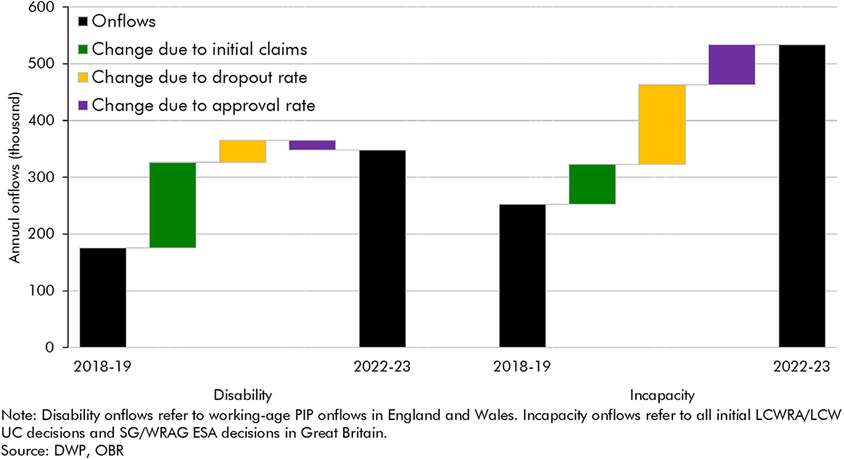
Working-age onflows to PIP since 2018-19 have grown at a similar rate to incapacity benefits onflows, with both roughly doubling over that period. Working-age PIP onflows increased by 98 per cent from 2018-19 to 2022-23, rising from 175,000 to 348,000. Incapacity benefits onflows increased by 111 per cent over the same period (from 252,000 in 2018-19 to 533,000 in 2022-23).a The drivers of higher onflows are very different across the two benefits, however. Chart D below decomposes these drivers:
Dropouts from PIP can be split into the following groups: claimants withdrawing their claim; claimants failing to return the PIP questionnaire (FTRQ); claimants dropping out between submitting a questionnaire and DWP referring them for assessment; and claimants failing to attend their assessment (FTA).
As shown in Chart E, most claimants who dropout fail to return the PIP questionnaire (FTRQ). These ‘FTRQ disallowals’ explain most of the fall in the dropout rate after 2019-20, falling from 100,000 in 2019-20 (20 per cent of initial claims) to 60,000 in 2020-21 (12 per cent of initial claims). This decreasing trend in FTRQ disallowals has brought the dropout rate down to 13 per cent in 2023-24, half its pre-Covid level.
DWP changed the process for submitting the PIP questionnaire (‘PIP2′) in March 2020 to include a reminder and an automatic extension of the deadline for submitting the PIP2 form by two weeks if a claimant runs out of time. And since March 2020, claimants have been able to submit PIP2 forms over email rather than by post. These changes, which are likely to have reduced FTRQ disallowals, mirror changes in the UC fit note verification process discussed in this chapter. This evidence therefore supports the idea that a fall in the number of ESA and UC claimants dropping out due to expired fit notes similarly explains the falling incapacity benefits dropout rate.
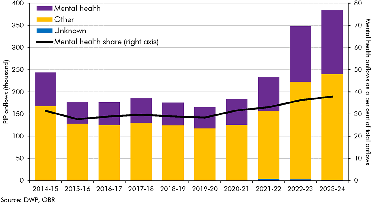
PIP onflows can be broken down by their primary health condition. Chart F shows PIP onflows for mental health conditions and all other conditions. Up until 2019-20, the share of onflows that were for mental health conditions was roughly flat; following the onset of Covid, this share has risen by a third, up from 28 per cent in 2019-20 to 38 per cent of onflows in 2023-24.
Unlike PIP, we do not know if the rise in UC onflows relates to claimants with a primary mental health condition, because UC assessment data does not record the primary condition of claimants (it instead records all conditions, and only since January 2022). A consistent time series of data on UC incapacity claimants’ conditions – ideally including primary condition for consistency with ESA – would allow us to better understand changes over time, and whether the rise in UC incapacity onflows reflects the trends seen in PIP and wider health surveys.
a) Incapacity benefits onflows are defined as the sum of work-related activity group and support group decisions for ESA and limited capability for work and limited capability for work or work-related activity decisions for UC.
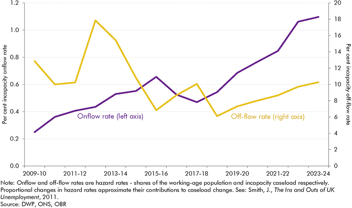
3.25 This section considers changes in off-flows in greater detail, focusing on reassessments and employment support programmes. Chart 3.3 above showed that off-flow rates, while volatile, fell from their 2012-13 peak through to 2018-19 and have been rising very slightly since, with Chart 3.12 presenting these trends on a quarterly basis.[52] In terms of the level of off-flows, Chart 3.12 shows a spike in 2012-13 as DWP reassessed many IB claimants under the tighter ESA WCA. Off-flows then mostly fluctuated between 40,000 and 60,000 per quarter before the pandemic reflecting: changing volumes of reassessments; wider labour market conditions; and the rising female state pension age, which lowered off-flows by allowing claimants to stay on the caseload for longer. The slump during the pandemic likely reflects the limited labour market opportunities available to claimants during that period.
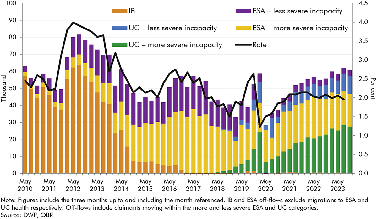
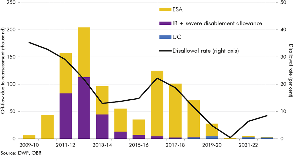
3.26 Reassessments have driven a third of all incapacity off-flows since 2009-10. The level of reassessment off-flows has varied significantly across this period (Chart 3.13):
3.27 In addition to reassessments, DWP has also substantially changed the employment support offered to incapacity claimants during this period. DWP has offered some form of employment support to incapacity benefits claimants since the early 2000s – spanning Pathways to Work, Work Choice, Work Programme, and the Work and Health Programme – but the volume of support, and whether claimants are obliged to engage with it, has changed over time.
3.28 The evidence on DWP’s largest employment support programmes since the introduction of ESA shows some positive but limited results:
3.29 In addition to these large programmes, some local authorities and combined authorities have developed their own employment support programmes for incapacity benefits claimants, but there is generally no robust evidence on employment entry and benefit off-flow from these programmes. Where there is evidence, it is often mixed,[60] and these programmes are generally small-scale.
3.30 Employment support programmes open to incapacity benefits claimants are typically open to a wide group of benefit claimants,[61] making it difficult within the evaluation evidence available to isolate impacts on incapacity benefits claimants in particular, and not all have undergone a quasi-experimental impact evaluation. That said, the limited evidence available does not suggest that employment support programmes have made a significant contribution to incapacity benefits off-flows.
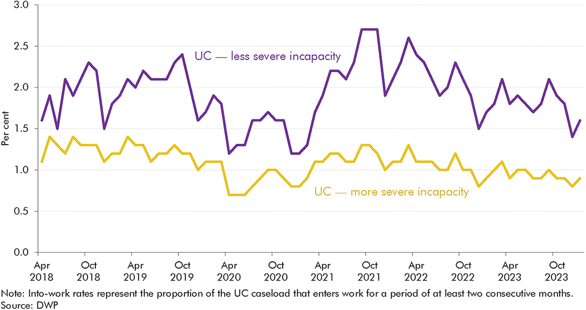
3.31 This conclusion is supported by the work entry rates of UC claimants, which have remained stable since UC was rolled out for most new working-age benefit claims from December 2018. Approximately 2.0 per cent of the less severe incapacity group moved into work each month in the year before the pandemic, compared to 2.0 per cent in 2022-23. The equivalent figures for the more severe incapacity group also changed little, from 1.2 per cent in 2019-20 to 1.0 per cent in 2022-23. Work entry rates fell to 1.4 and 0.9 per cent for more and less severe cases respectively during 2020-21 at the height of the labour market disruptions caused by the pandemic.
4.1 Our forecasts are always subject to a range of risks and uncertainties, which we try to highlight in our Economic and fiscal outlooks (EFOs). In analysing the evolution of incapacity benefits caseloads and spending, this report illustrates several of the risks and uncertainties surrounding our most recent welfare spending forecast, both to the upside and the downside. In this chapter we conclude by briefly setting out some of the key risks and uncertainties for welfare spending that emerge from the preceding chapters.
4.2 The analysis in this report, and particularly the detailed examination of flows onto and off incapacity benefits in recent years, provides a range of insights for our future forecasts. Recent trends reinforce the importance to our forecast of assessing all three of the key historical drivers of incapacity benefits caseloads and spending – working-age population health, the state of the labour market, and the structure of the benefits system. Several of the findings in this analysis particularly highlight the importance of the policy and operational features of the benefits system.
4.3 One of the most significant features is that only a minority (20 per cent) of the rise in incapacity benefits onflows between 2010-11 and 2022-23 reflects a higher number of people initiating claims. Lower dropout rates (explaining 30 per cent of the rise in onflows) and rising approval rates (explaining 50 per cent) have been more important. The reasons for the rise in initial claims, fall in dropouts, and higher approval rate are not clear-cut, but our analysis has identified several factors:
4.4 In terms of off-flows, only reassessments appear to have substantially changed caseload trends, particularly in the early 2010s. There is inconclusive evidence in relation to the effects on off-flows of employment programmes for incapacity benefits claimants.
4.5 And our broader historical analysis shows that, over the past half century, the incapacity benefits system has rarely reached any kind of steady state, making the basis from which to forecast future trends highly contextual and uncertain.
4.6 These and other insights provide areas for further research or information, and issues that we will place greater emphasis on in our forecast scrutiny, working with DWP analysts.
4.7 Analysing changes in incapacity benefits is made harder by limited data and research available on UC incapacity claimants. The most critical gaps are:
4.8 Our analysis has identified several risks to our forecasts which we will scrutinise in more depth in future, notably:
(1) The welfare system contains several benefits that aim to support people affected by sickness or disability. The main distinction we draw within these is ‘incapacity benefits’ – benefits that provide income replacement to those who find it difficult to work due to ill health – and ‘disability benefits’ – which cover the extra costs of daily living and mobility associated with disability and long-term health conditions, regardless of whether the individual is working or not. This report focuses on incapacity benefits, with our January 2019 Welfare trends report having focused on disability benefits.
(2) ‘New style’ ESA remains the route for contributory claims, and some claimants receive both new style ESA and UC. Our March 2024 forecast assumed that the transfer of existing income-related ESA claimants to UC finishes in 2029-30.
(3) On our preferred measure shown in Chart 2, onflows rose by around 80,000 a year between 2010-11 and 2014-15, whereas on the broader measure shown in Chart 3, they rose by around 110,000 over this period. Chart 3 is based on total onflows, rather than just in-payment onflows, which is why the annual onflow numbers are higher than those in Chart 2. We focus on the level of onflows shown in Chart 2 but interpret it using the changes described in Chart 3.
(4) Most incapacity benefits are for claimants below the state pension age, so we largely exclude spending on pensioners in this report.
(5) Universal credit began to replace income-related ESA from 2016. New claims to income-related ESA ceased, with minor exceptions, in December 2018, and stopped completely from 27 January 2021. Claimants with enough Class 1 or Class 2 National Insurance contributions can still make a claim for contributory or ‘new style’ ESA.
(6) OBR, Supplementary forecast information release: Upward revisions to welfare spending since March, November 2022; OBR, March 2023 Economic and fiscal outlook.
(7) In this WTR, we only consider benefits in Great Britain due to different data collation in Northern Ireland. Incapacity benefits are not devolved to Scotland or Wales. The only exception is in Box 3.3, where we compare trends in incapacity benefits in Great Britain to trends in working-age disability benefits in England and Wales, excluding Scotland (because disability benefits are devolved to Scotland).
(8) In November 2020, around two-in-three claimants who received ESA or UC also received PIP or DLA, and around two-in-three claimants who received PIP or DLA also receive ESA or UC. See: DWP, Shaping Future Support: The Health and Disability Green Paper, evidence pack, July 2021.
(9) To keep spending on UC health-related claimants in this analysis broadly comparable to spending on claimants in receipt of previous incapacity benefits, we only include spending on the UC health and standard elements for claimants in the limited capability for work (LCW) and limited capability for work and work-related activity (LCWRA) groups. We do not include other elements of UC that claimants in the LCW and LCWRA receive, such as the housing or child elements.
(10) Though mainly working-age (and children’s) benefits, DLA and PIP are also claimed by pensioners. People over the state pension age making a new claim for an extra-cost disability benefit now claim for attendance allowance, but many existing claimants stay on DLA or PIP when they move into pension age.
(11) We compare recent trends in incapacity benefits to working-age disability benefits in Box 3.3.
(12) Most working-age benefits are uprated by the CPI figure from September of the preceding year, so the 2022 spike in inflation was not reflected until the financial year 2023-24.
(13) Counting individuals in a household with UC LCW or LCWRA status counts each member of the household as an individual in receipt of an incapacity benefit. ESA is paid to individual claimants so only counts individuals in receipt of ESA. This only affects caseload comparisons – there is only one LCWRA payment per household, so this does not affect comparisons of spending.
(14) For more detail see our November 2023 Economic and fiscal outlook.
(15) In addition, the rising caseload figures include some credits-only cases who do not receive payments.
(16) Banks, J., et al., Disability, Health and Retirement in the United Kingdom, IFS Working Paper W11/12, February 2011.
(17) The ONS General Household Survey reports demonstrate that the proportion of men and women reporting a longstanding limiting illness was generally stable between 1978 and 1995.
(18) Beatty, C., and S. Fothergill, Labour market adjustments in areas of chronic industrial decline: The case of the UK coalfields, 1996; Beatty, C., S. Fothergill, and R. Macmillan, A theory of employment, unemployment and sickness, 2000; Beatty, C., and S. Fothergill, The diversion from ‘unemployment’ to ‘sickness’ across British regions and districts, 2005.
(19) Beatty, C., and S. Fothergill, Labour market adjustments in areas of chronic industrial decline: The case of the UK coalfields, 1996.
(20) Beatty, C., S. Fothergill, and R. Macmillan, A theory of employment, unemployment and sickness, 2000; Beatty, C., and S. Fothergill, The diversion from ‘unemployment’ to ‘sickness’ across British regions and districts, 2005; Beatty, C., and S. Fothergill, Labour market adjustments in areas of chronic industrial decline: The case of the UK coalfields, 1996.
(21) Beatty, C., and S. Fothergill, Hidden unemployment among men: a case study, 2002.
(22) Huddleston, T., Explaining the Growth in the Number of People Claiming Incapacity Benefits, 2002.
(23) Beatty, C., et al., Women on incapacity benefits, 2009.
(24) The Pathways to Work programme assisted incapacity benefits claimants into, and towards, paid work. The programme introduced mandatory work-focused interviews with specialist incapacity benefit personal advisors and offered a range of services focusing on work and health.
(25) DWP, Pathways to Work: programme engagement and work patterns, 2010.
(26) DWP, A new deal for welfare: Empowering people to work, 2006.
(27) DWP, No one written off: reforming welfare to reward responsibility, 2008.
(28) New claims to income-related ESA mostly stopped in December 2018 with a few exceptions, but ceased entirely from January 2021.
(29) Claimants with enough Class 1 or Class 2 National Insurance contributions can still make a claim for contributory or ‘new style’ ESA. The Government spent £4.9 billion on contributory ESA in 2023-24.
(30) In addition to the 0.7 million of remaining income-related ESA claimants, there are a further 0.3 million ESA claimants with both income-related and contributory components.
(31) Universal credit health data by age is not available prior to April 2019.
(32) In most cases this is the state pension age, although some claimants can continue to claim after reaching state pension age. Households on universal credit where one claimant is older than the state pension age and in receipt of attendance allowance, personal independence payment enhanced-rate daily living component, or disability living allowance highest rate care component can be in the more severe incapacity group.
(33) For ESA claimants, working more than the permitted work hours can result in an off-flow; for UC, earning over a certain amount would result in an off-flow.
(34) When we analyse caseloads in this chapter, we look solely at the more and less severe incapacity caseloads for UC and ESA and exclude those awaiting a work capability assessment (‘assessment phase’ on ESA or a claimant with a ‘live fit note’ on UC) because of important differences in the process for making a claim for UC health in comparison to making a claim for ESA (see Table A in Box 3.2).
(35) Includes all onflows in the three months up to and including the month referenced.
(36) The support group in ESA and the limited capability for work and work-related activity group in UC.
(37) Chart 3.5 is based on total onflows, rather than just in-payment onflows, which is why the annual onflow numbers are higher than those in Chart 3.2. We focus on the level of onflows shown in Chart 3.2 but interpret it using the changes
described in Chart 3.5.
(38) Dropout rates refer to the share of initial claims that are withdrawn prior to reaching a WCA decision.
(39) We decompose changes in onflows between 2010-11 and 2022-23 in this section because we do not have data on the ESA assessment phase caseload before February 2010 and cannot calculate dropouts for that period, and we do not have complete initial claims and WCA decisions (onflows) data to calculate approval rates and onflows for 2023-24.
(40) Submitting a claim for ESA is a different process to reporting a restricted ability to work in UC, but it is broadly comparable to the start of an incapacity claim before undertaking a work capability assessment. See Table A in Box 3.2 for more detail on the differences between ESA and UC health.
(41) A larger share of claimants come to the UC health caseload from the intensive work search conditionality group (IWS) than came to ESA from jobseeker’s allowance, but this may simply reflect the fact that IWS in UC is a much broader group that those who received jobseeker’s allowance.
(42) Dropouts include claimants who have short-term illnesses and whose fit note expires before they reach a WCA.
(43) Phone assessments were first introduced in May 2020, with face-to-face assessments reintroduced in May 2021. During the period in which face-to-face assessments were paused, DWP focused on individuals who were more likely to attract a higher benefit award rather than the usual practice of assessing individuals in date order. When face-to-face assessments resumed in May 2021, DWP reverted to prioritising WCAs in date order, which caused a spike in customer journey times in July 2021 as many older cases were assessed.
(44) The UC data system may also play a role in the falling dropout rate. Up until November 2023, a claimant with an expired fit note with expiry lasting more than 10 days would be removed from the UC health caseload as a dropout. That same claimant may rejoin the caseload with a new fit note, meaning that one claimant could be counted as a dropout multiple times if they had multiple fit note expiries. In November 2023, DWP improved its fit note processes, which is likely to reduce this churn due to claimants with multiple fit note expiries.
(45) Claimants were still required to keep the fit note should DWP need to see it in the future.
(46) Institute for Employment Studies and DWP, Unsuccessful Employment and Support Allowance claims – qualitative research, July 2011.
(47) Figures in this paragraph are quarterly, referring to the three months up to and including the month referenced.
(48) These include: changes to 10 of the 17 descriptors and the removal of three descriptors in 2011 after DWP’s 2009-10 review of its descriptors; the suspension of work-focused health-related assessments in 2010; the introduction of the decision assurance call to the process after the first review of the WCA, where DWP decision makers attempt to contact claimants by telephone before taking a final decision in order to offer the opportunity to provide further evidence; changes to the way claimants with cancer were assessed in January 2013, which expanded the categories of cancer treatments under which a claimant may be treated as having limited capability for work or work-related activity (LCWRA).
(49) Claimants in the more severe incapacity group are not subject to the benefit cap. The benefit cap was frozen in cash terms until April 2023, which subjected an increasing number of households in receipt of UC to it. See DWP, Benefit cap: number of households capped to February 2024, June 2024.
(50) This financial distinction was further increased by the benefit freeze between 2016-17 and 2019-20, which froze the UC standard allowance and less severe incapacity additional element in cash terms, but not the more severe incapacity additional element.
(51) Baumberg Geiger, B., After the WCA: Competing visions of disability and welfare, July 2024.
(52) The off-flow rate here is lower than presented in Chart 3.3 as it is quarterly rather than annual. The off-flow rate in this chart includes cases not in payment and does not backdate incapacity benefits decisions to when the award is applied from, so the rise following the pandemic is shallower than in Chart 3.3.
(53) The disallowal rate is the share of reassessments yielding a ‘fit for work’ or ‘capability to work’ outcome and therefore resulting in an incapacity off-flow.
(54) DWP, Government Response to the Work Capability Assessment: Activities and Descriptors Consultation, November 2023.
(55) DWP, The Work Programme: A quantitative impact assessment, November 2020.
(56) Based on DWP’s unpublished analysis of the Work Choice programme.
(57) DWP, Work and Health Programme evaluation: synthesis report, October 2023.
(58) The health-led employment trials tested a voluntary employment support programme for people either living with severe and enduring mental illness in secondary care or experiencing mild to moderate mental and/or physical health conditions in primary and community care.
(59) DWP and DHSC, Estimates of the impact of IPS over 12 months: Health-led Employment Trial Evaluation, April 2024.
(60) For example, WorkWell, the Greater Manchester programme aimed at helping long-term ESA claimants into work between March 2014 and March 2016, had a statistically significant impact on time spent in work, but no statistically significant impact on any periods spent off out-of-work benefits. See: DWP, Greater Manchester Working Well: early impact assessment, March 2018.
(61) For example, 51 per cent of claimants starting Work Choice in 2017-18 were JSA claimants. Source: DWP, Work Choice: referrals, starts and job outcomes to October 2019, September 2020.
(62) Primary health condition data is available for incapacity benefit, employment and support allowance, personal independence payment and disability living allowance.
(63) See OBR, Fiscal risks and sustainability, July 2023.
(64) We layer changes on top of that to account for additional judgements and policy.